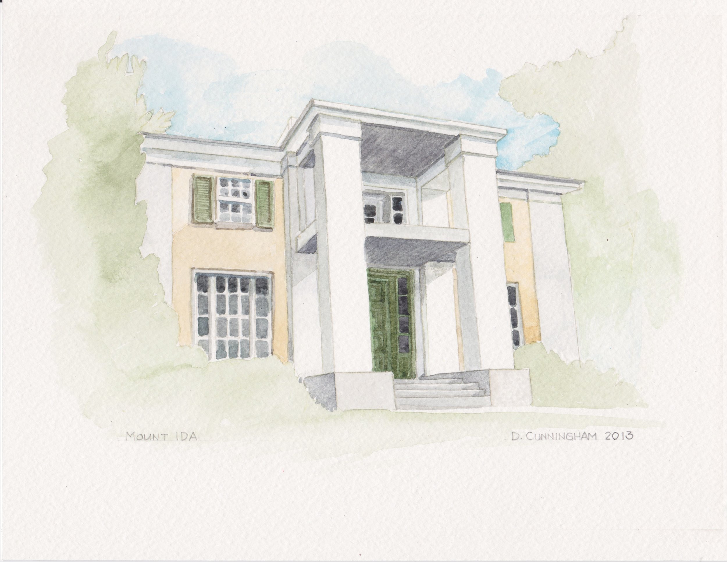
After a two year hiatus from participating in the HEC Decorator Show House, I have had the pleasure to design the grand foyer of this year's house, Mount Ida. Knock on wood, that all of the efforts of the designers, volunteers, and workers will pay off with a record turn out of visitors! For tickets and more information, click here. My rendering for this year's promotional material.
Mount Ida is located atop the hill next to the Court House in Ellicott City. Originally built in 1828 by members of the Ellicott Family, Mount Ida was built in the Greek Revival/Italianate style. Sometime in the 1970's or 80's, the foyer was divided up into three spaces but has now been restored to all 30 feet of its original glory. In designing the space, I wanted to honor tradition but had to add my own twist.
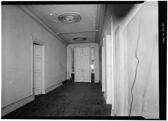
The original foyer, as seen in this photograph from the Library of Congress, taken in the 1960's.
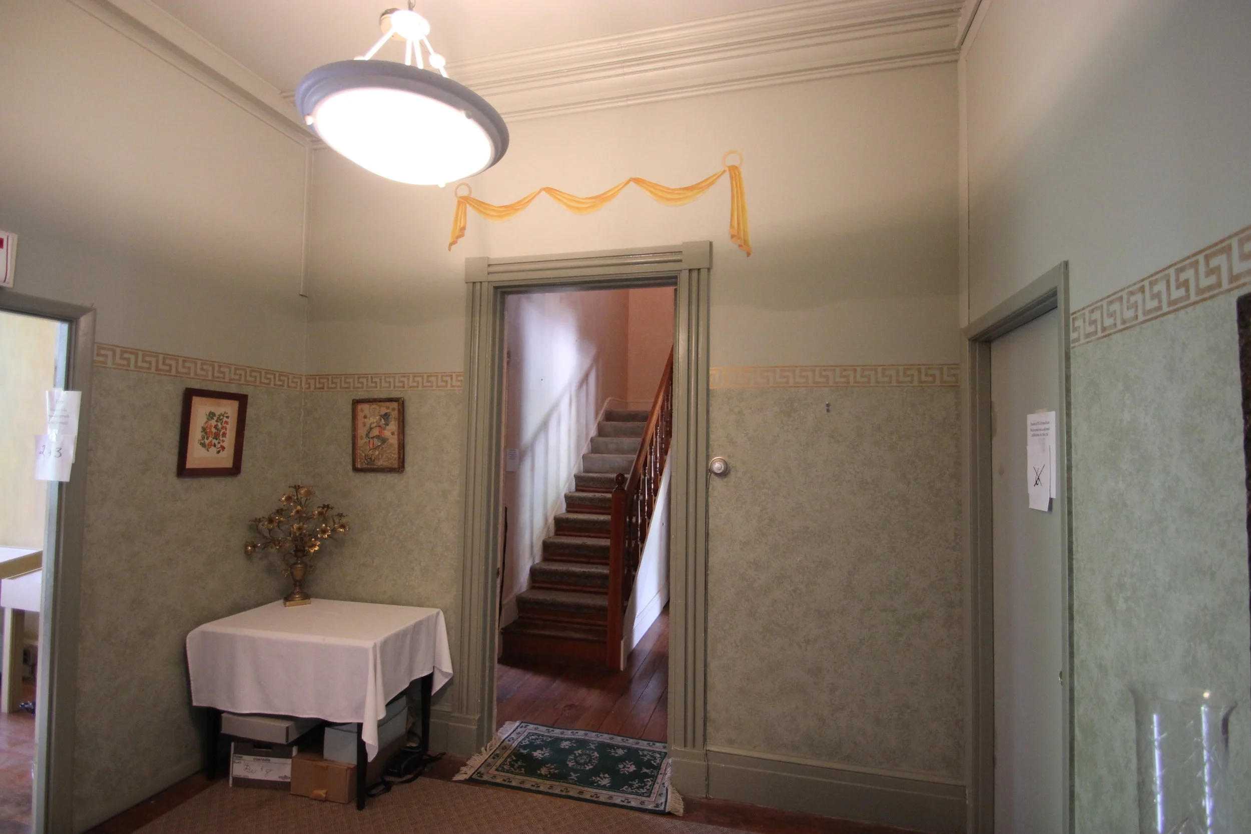
This picture shows what I saw when I did my walkthrough. These partitions were put in place sometime in the last few decades and the decor was left from when Mount Ida was a decorator showhouse in 1995. This is taken from the same vantage point as the black and white photo above.
You then passed from the first space into this room. This is the central area of the foyer. The door to the right led to an office.
The first thing that happened was all of these walls, including a wall covering the back doors were taken down. Repairs, scraping, cleaning, painting, and more painting took place over the course of 8 weeks.
And here are a few images of what my space looks like now just to tease you!
Knock on...wood? You will have to come see for yourself!! ;)
Look closely at the chandeliers that Bill Knapp fabricated. Can you tell what they're made from?
This is Brian, the contractor who HEC hired to do all of the renovations that needed to be done, like fixing the waste stack that exploded in my space the week before I was to start. (I know. gross.)
--------
I really have to thank several people for making my vision happen.
-Paula Henry of Simply Put Interiors for help with the design layout, moral support, and great friendship.
-Bill Knapp, Bill Knapp Arts, for without him we would be in the dark.
-Alison Roy-Harrison of Columbia Interior Finishes for doing all of the basecoating for my space.
-Phil Adams from Floors Etc for my area rugs (all three of them!)
-Amy Alder for her upholstery expertise
-My mom, Carol Lenehan for her immaculate sewing skills on the skirted tables.
-My dad, Kevin Lenehan, for helping me build the skirted tables and wiring the chandeliers (all three of them!)
-Barry Sheehan- Metal in Motion, for helping out with my brainfart that "there should be a sculpture here..."
-The volunteers and members of HEC, Inc.
and Mikey, for his patience.
-------
We all hope to see you there!

