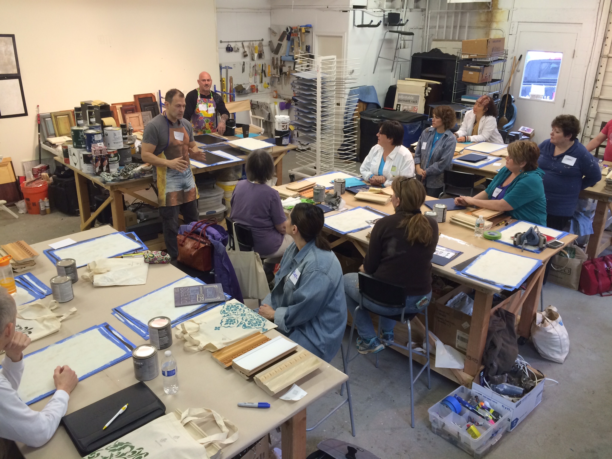
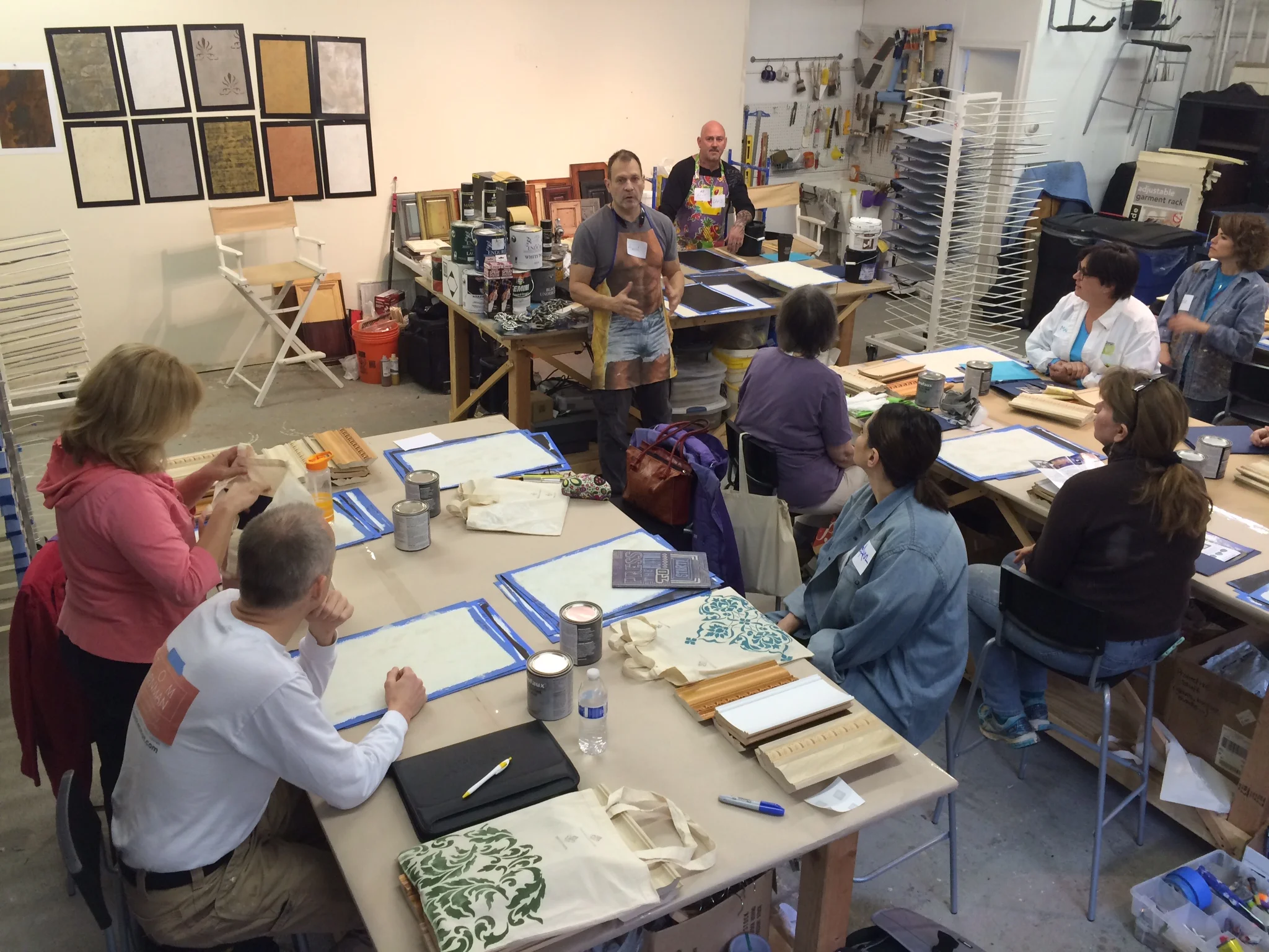
We had a BLAST this past weekend at the studio! Henri Menendez and Chris Burke, aka the "Faux Team" hit it hard with their expertise on cabinet refinishing and faux finishing work. We learned about how to apply professional finishes to cabinetry and furniture and Firenze Plasters. A lot of knowledge was shared and students came all the way from Upstate New York, Connecticut, New Jersey, Pennsylvania, Maryland, Virginia, North Carolina....and TAIWAN!! Thanks to everyone for making it out, I hope you enjoyed Ellicott City and can't wait to come back! To find out about upcoming classes, be sure to sign up for our newsletter!
Getting Back My Mojo
As promised, I am posting some shots of the progress on my first "for-me" painting. I'm really excited an have gotten some good feedback on Facebook and in person.
Here it is today. Still have a bit to go, haven't touched the foreground yet. The lower portion of the window and the chairs are still incomplete. Moving along though and it feels great. I'm tossing around a few ideas on a name but am open to suggestions. Thoughts?
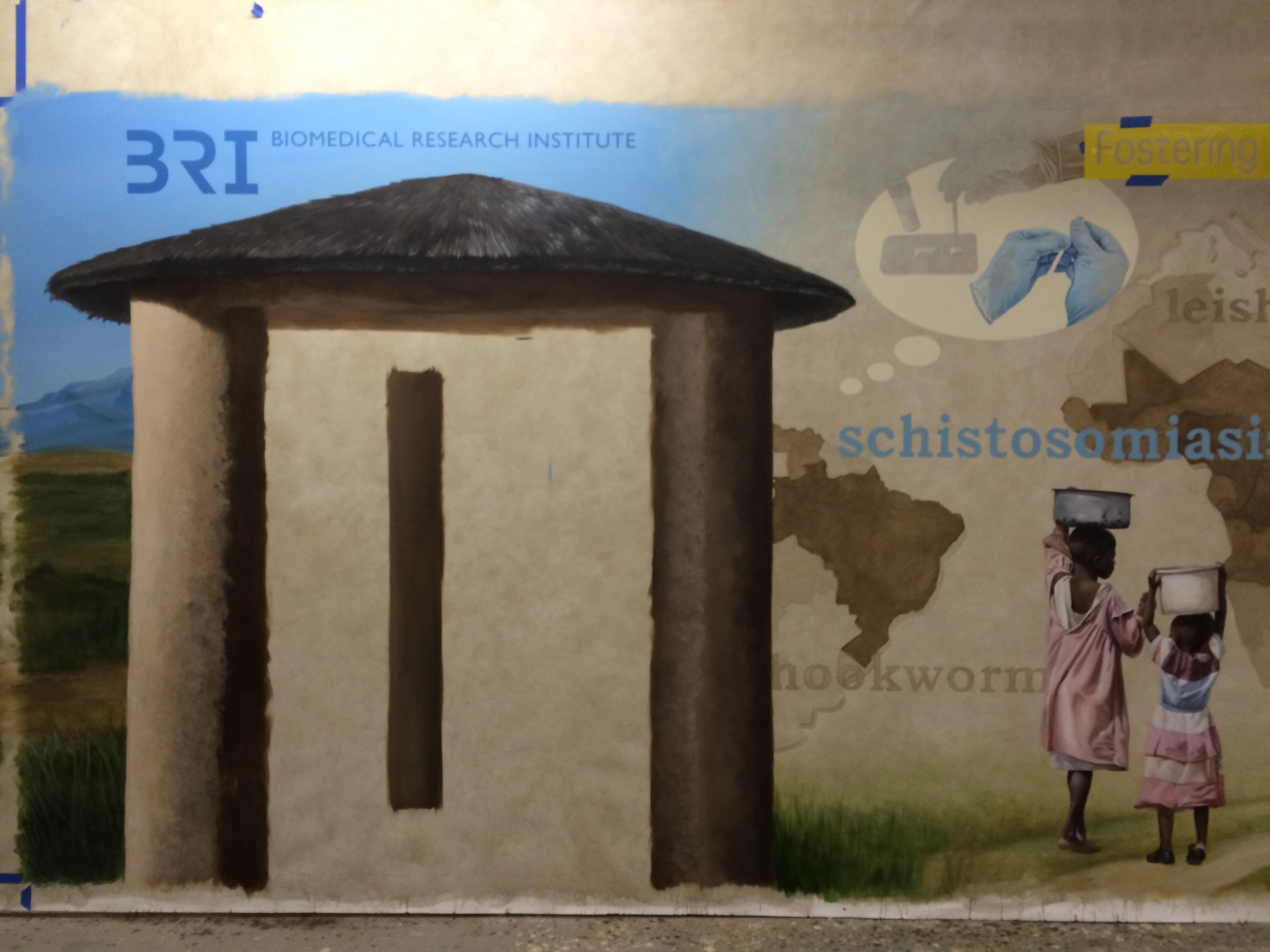
Also, in the studio, my good friend and fellow artist Stacey Olson Sachs has me working on one of her commissions. We are learning a lot from one another. I helped achieve the effect for the background using a parchment type glazing treatment as well as the map and gradation of the blue sky that fades out. In exchange, I am learning to "see" more than what actually in a reference photo. I am earning my Artistic License!
I will be helping install this first half coming up on Friday. There will be a second part to this leading in from the left that will tell the story of people in West Africa contracting the parasitic disease known as Shistosomiasis. Biomedical Research Institute does research for this disease and harvests affected snails (part of its life cycle) which they supply to other researchers for drug development. Vaccine development is what they're aiming for in their future. It will be installed in their lobby. Stacey has a background in Medical Illustration and so this is right up her alley.
Its been the perfect way to get back into working again, we have lots to talk about including work, philosophy, and family! And the best part is all I have to do is show up and paint! Stay tuned for photos of the installation. Follow on facebook too!
Happy Accidents
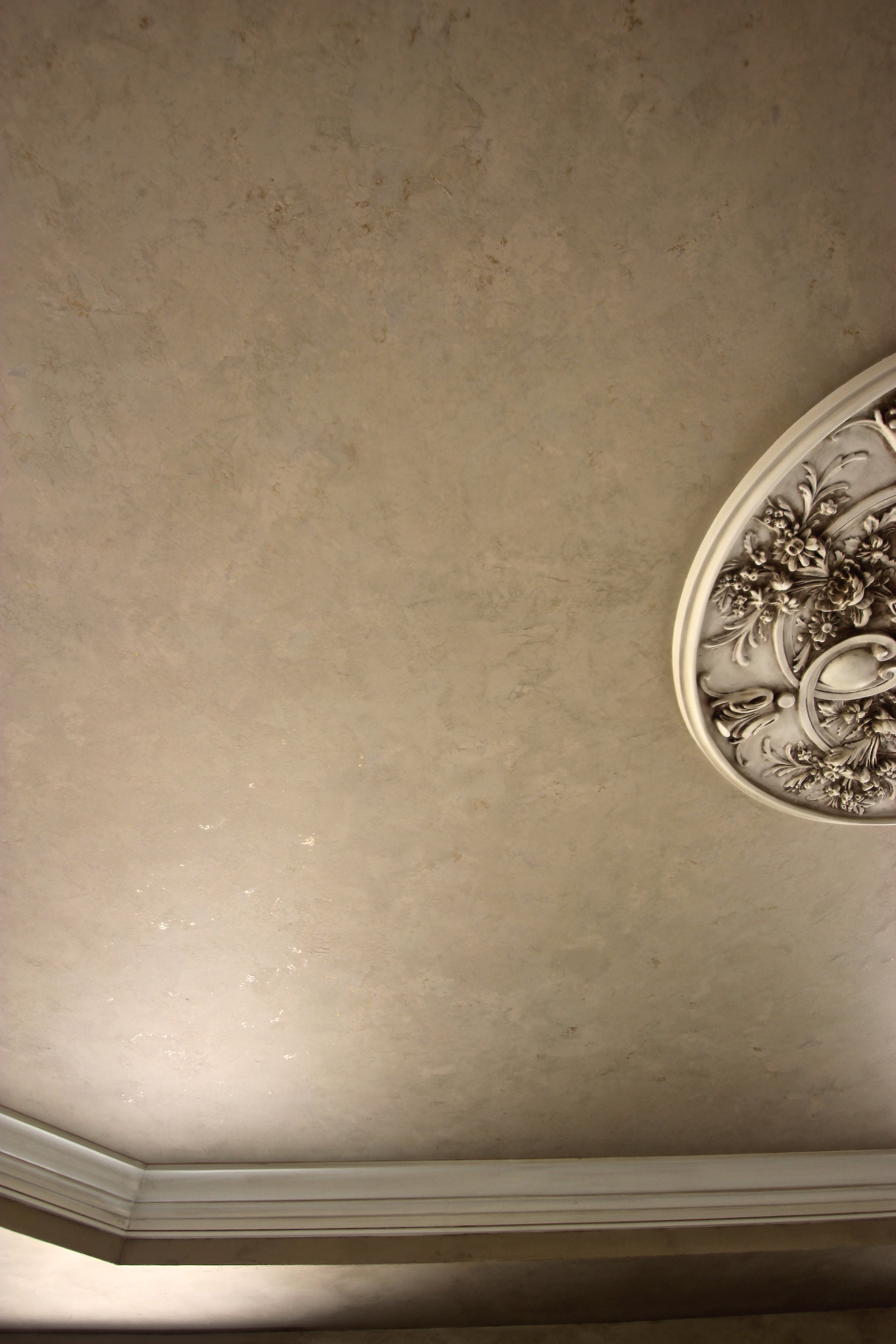
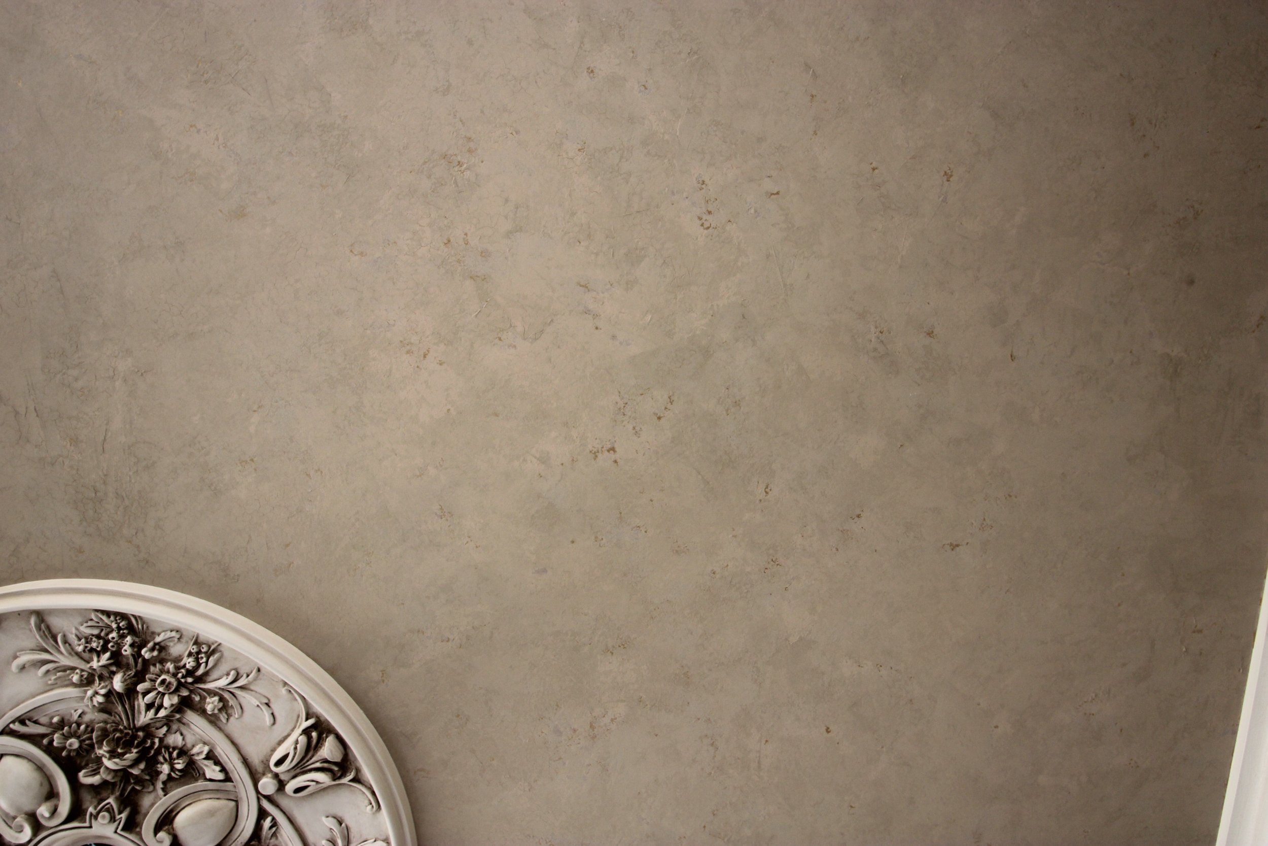
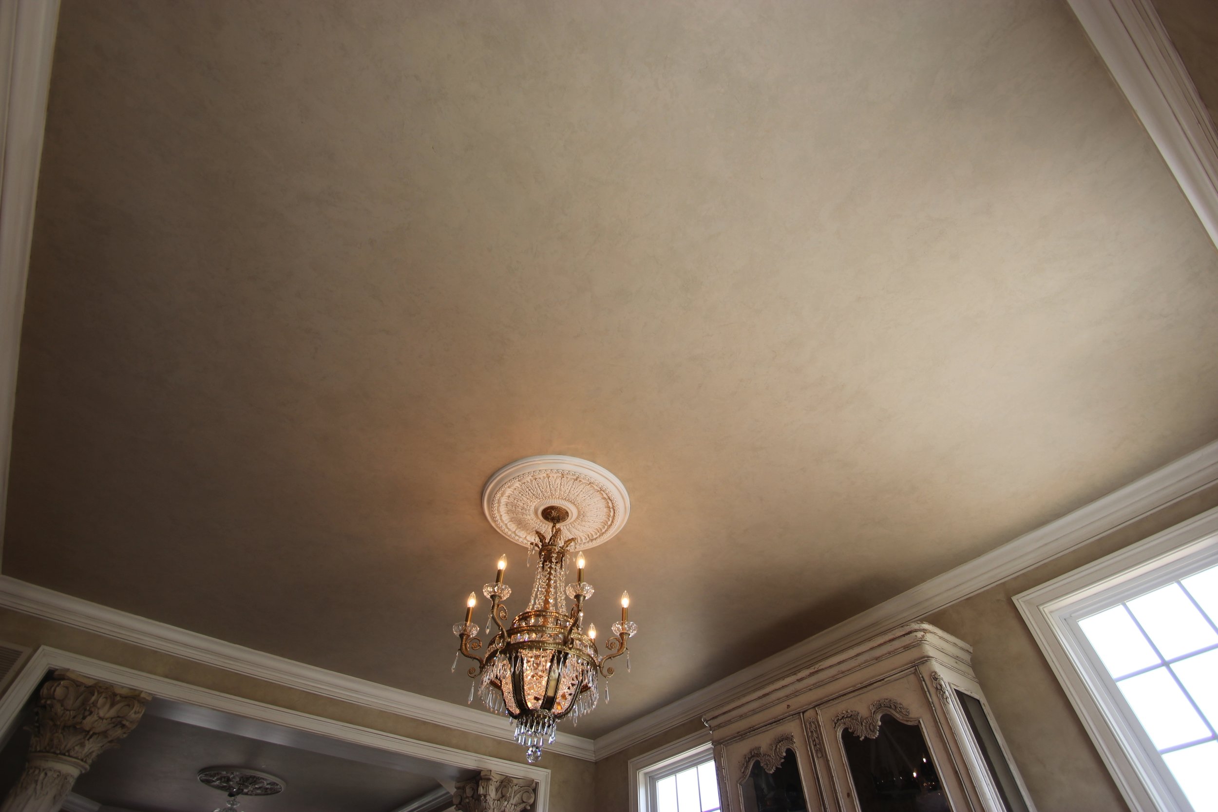
Not everything goes according to plan. (That should be this year's motto.) With this job I had a major "oops" where the finish I was supposed to do on the ceiling didn't quite turn out as planned.
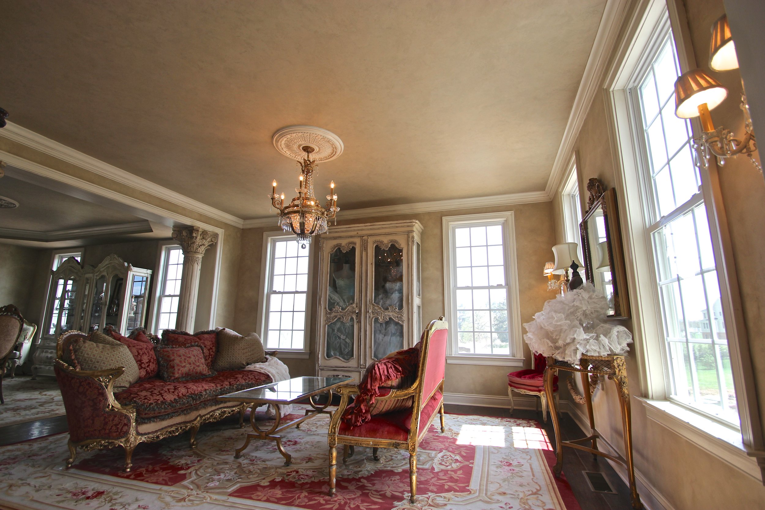
I had completed the walls last year with a glazed plaster texture and the client wanted to do something on the ceiling that complimented but didn't upstage them. I also had glazed the trim in her kitchen to match the cabinetry and she wanted to do the same in these rooms too. Normally when I do samples I keep notes and swatches of the different paint colors and mixes that I use. For some reason I didn't do that this time. Don't ask me why. I'm usually good at remembering my process but this time I don't remember what I did. I tried guessing but that didn't quite work. I was about to pull the plug and start over but thankfully my client talked me off the ledge. We came up with a solution that turned out to be even better than the original plan.
Trim and Wainscotting: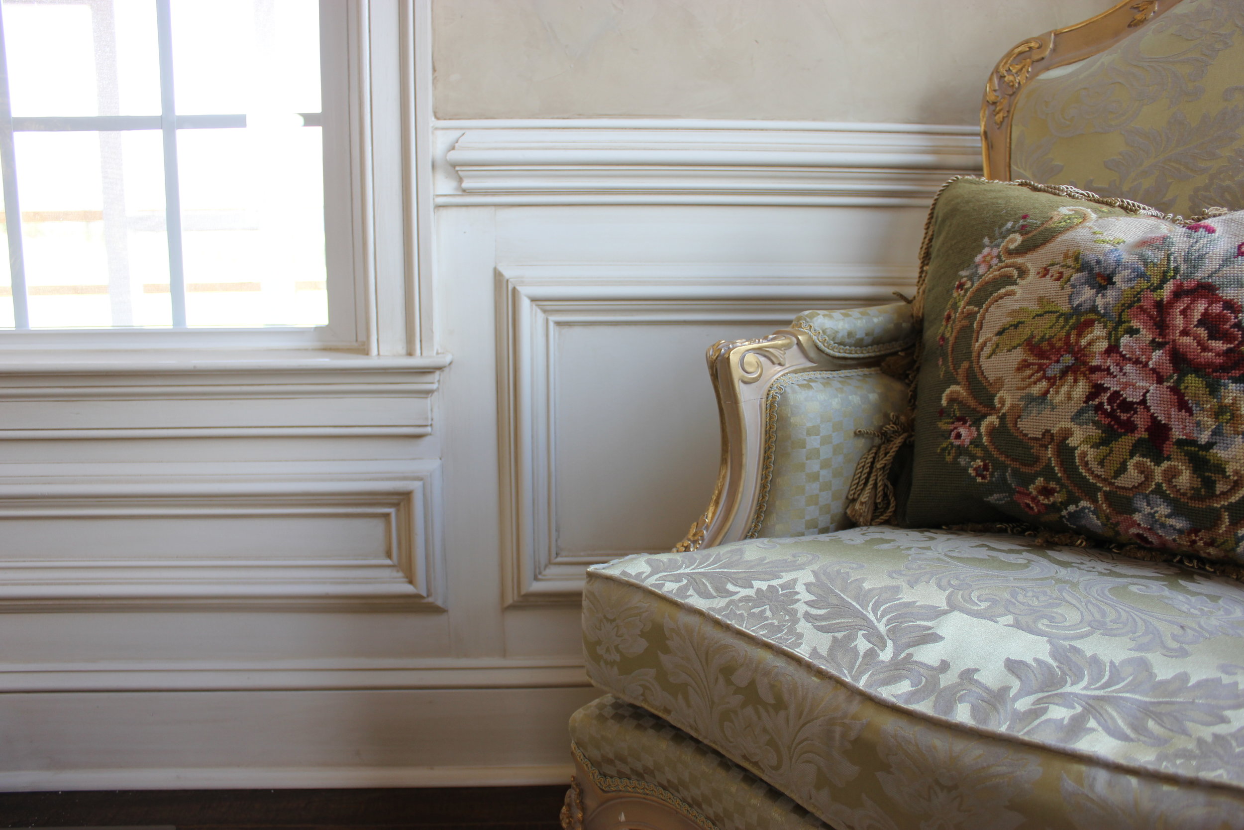
I have to say that normally I would be mortified that the job went south but with a client like this, who is very creative and flexible, was absolutely amazing.
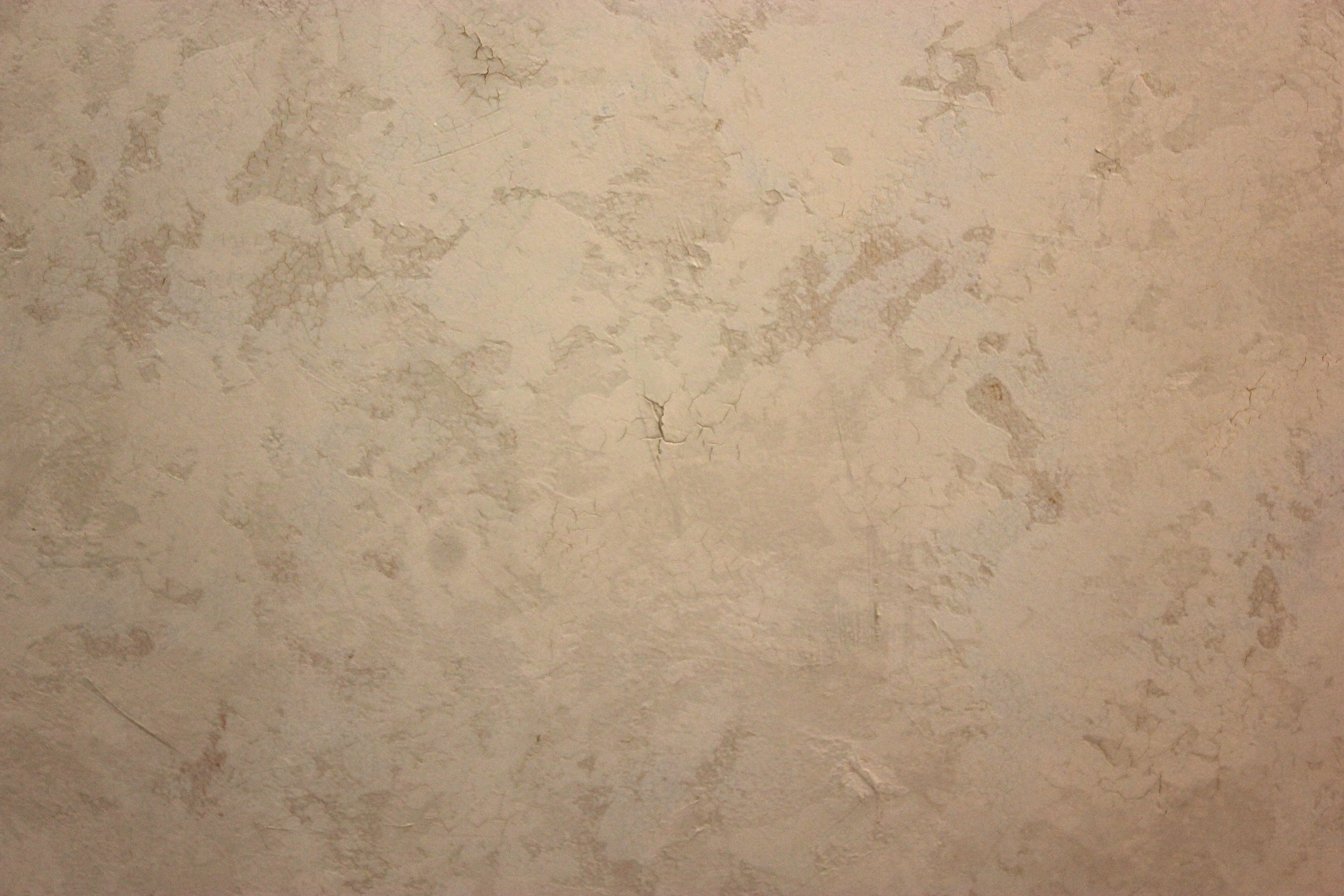
Its so hard to capture the subtlety so I pumped up the definition a bit. If you'd like to see the finish in person give me a call, I now have a sample that matches!
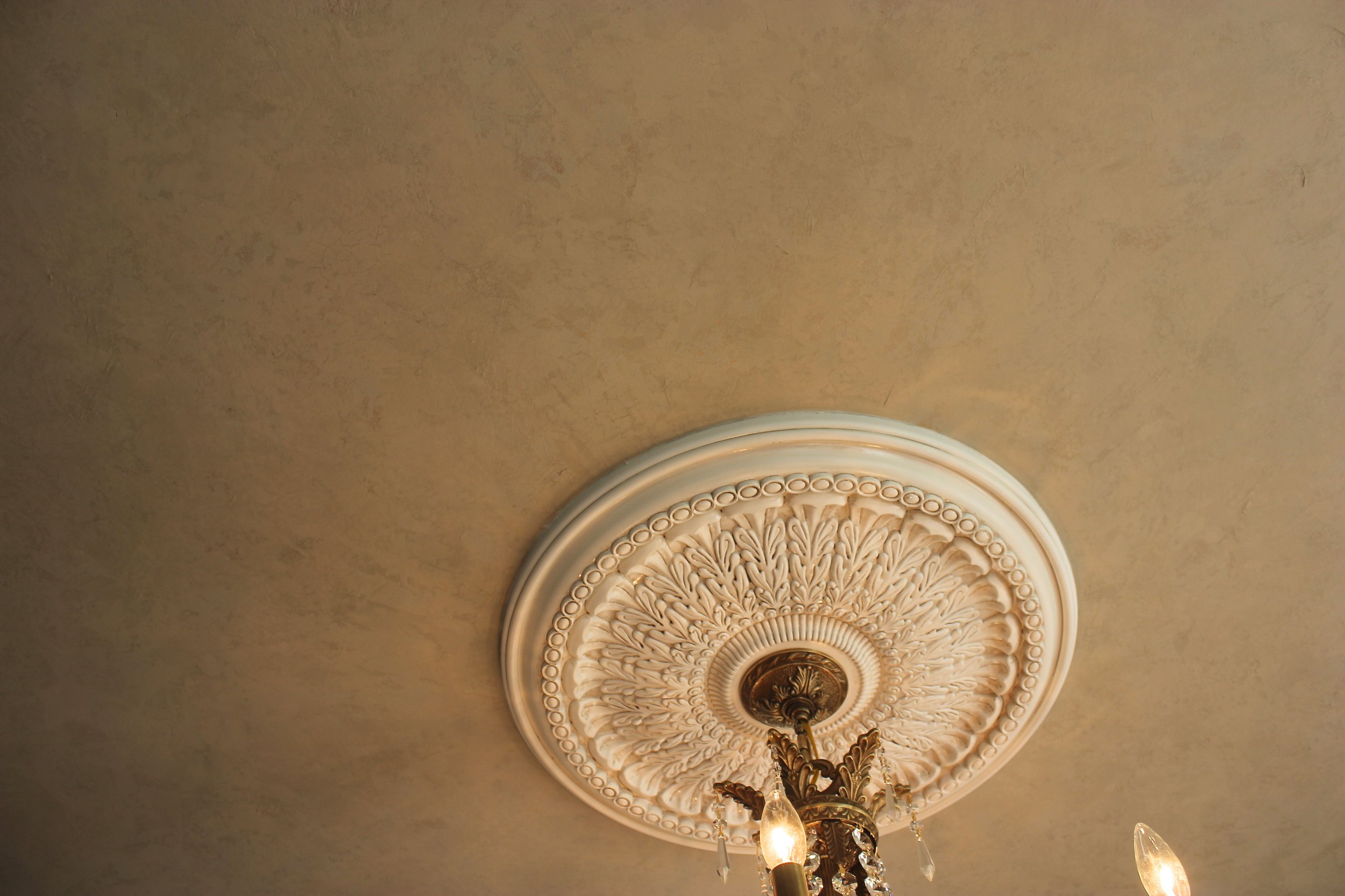
The final result is what to me looks like what could be a deteriorated plaster with hints of old wallpaper discoloration on a Parisian apartment salon wall. It has a very subtle crackle with gold peeking though. The colors are all slight variations of taupe, grey, and tan. I am absolutely in love and have tried doing this type of finish several times with no success. I guess you could say it was a happy accident!
I'll show you mine if you show me yours...
I've decided to start a new series where we share our work spaces...I hope to post more photos as people share them with me. If you have some you'd like to share, email me at dee@deelitedesign.com I've always loved exploring how other artists organize and use their space for work and inspiration. I've asked some of my artist friends to share photos of their spaces. What was so surprising is how embarrassed they were about showing their space! As if a messy studio was a sign of failure! I know when Im working, my space blows up. After each project I have to reset; clean up, put things away, reorganize. When I'm working I am in the moment. As my mom would call it, it looks like a dumping ground! (Keep in mind, both of my parents are neat freaks so having a mess was a n0-no.) Back when I first started working as an artist, my time was split between my basement and my parents' basement. They had tall ceilings where I could do murals. Nothing is better than being able to leave and shut the door without worrying about who's going to care about my mess!
My studio: in current condition...
Storage underneath tables that roll, paints on metal shelves, and storage above for things used less often. On the mural wall, a work in progress. The wall itself has been used as a practice surface for large scale glazing.
Ladders and scaffold against the wall, and to the right of the frame, my spray area. Currently being used as storage.
Without further ado, here are some other studios who's owners have graciously allowed us to peer inside. Enjoy!
My neighbors Bill Knapp, billknapparts.com and Barry Sheehan, barrywsheehan.com, who share a space...they are metal sculptors. Each have their own separate businesses but share space.
Bill
Bill's area
Barry working.
My other neighbor, Zach Bowler's studio. He is a ceramic artist. I love what he's done with creating a lounging area in the back.
My friend Jeanne Shnupp works in Long Island and does decorative painting like me... jeanniesdesigns.com It seems we all have a need for places to store things!
Arlene McLoughlin's space. She also works in Long Island as a decorative artist. arlenemurals.com
Thanks for sharing your spaces with us!
An Insider's Look at the "Make Room" exhibit at the ACC show in Baltimore
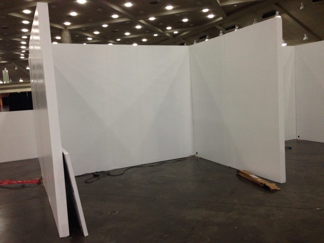
Before, a 10x10 box.
This past February, Paula Henry asked me to create a piece for her "Make Room" exhibit at the ACC show in Baltimore. Its essentially a "white box challenge" where designers are offered a few pieces by artists exhibiting in the show.
The finished room.
Paula chose the cocktail table and two chairs to inspire her design. In addition, they were given a theme; this year's being "Entertainment." To add to this theme, I decided to do a dynamic painting of glasses and bottles in a limited color palette to convey the feeling of celebration and excitement.
The piece measures 36"x48". It is currently available. (can be hung vertically also.)
We had a great time, even the mayor stopped by!
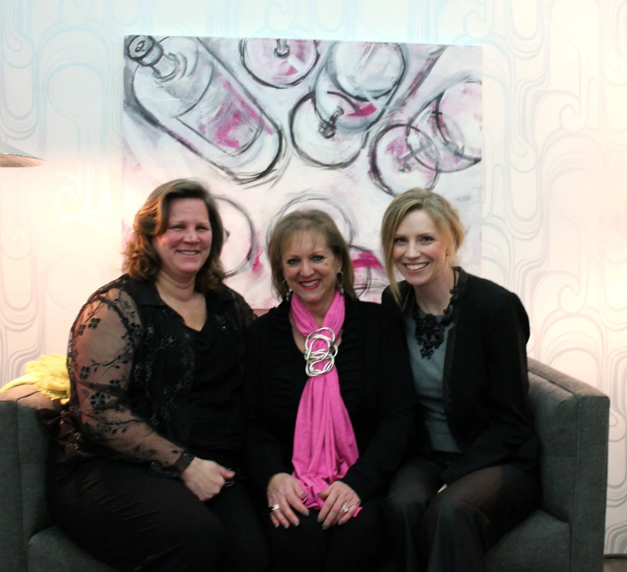
Gael Summerhill of Summerhill Cabinets, Paula Henry of Simply Put Interiors, and myself.
