Casual Elegance

IMG_0539

IMG_0539

As promised, here's the latest project I completed. First off, the ceiling in the family room had some great beams but felt cold left white. We decided to woodgrain them to match the other wood tones throughout the home.  The centers of the coffers were treated with a custom textural paint/plaster to create a more casual feel compared to the foyer, living, and dining rooms because this is where the family gathers.

2012-04-17_15-08-46_77

2012-04-17_15-08-46_77

Progress...the beams were treated first.The area on the left has the second layer of woodgraining while the right only has the first layer.

2012-04-20_16-23-26_323

2012-04-20_16-23-26_323

Here you can see the finished look at the top of the picture. The bottom three have the texture applied but haven't been glazed yet.

And...(drum roll please)......

IMG_0811

IMG_0811

Tada!

Here's some closer shots taken from the balcony

IMG_0890

IMG_0890

IMG_0892

IMG_0892

And here are the other three ceilings completed while on the project.

IMG_0901

IMG_0901

Living room

IMG_0905

IMG_0905

Dining Room (Medallion treated also)

IMG_0803

IMG_0803

Vestibule (This finish was really fun to do and would look great anywhere!)

IMG_0879

IMG_0879

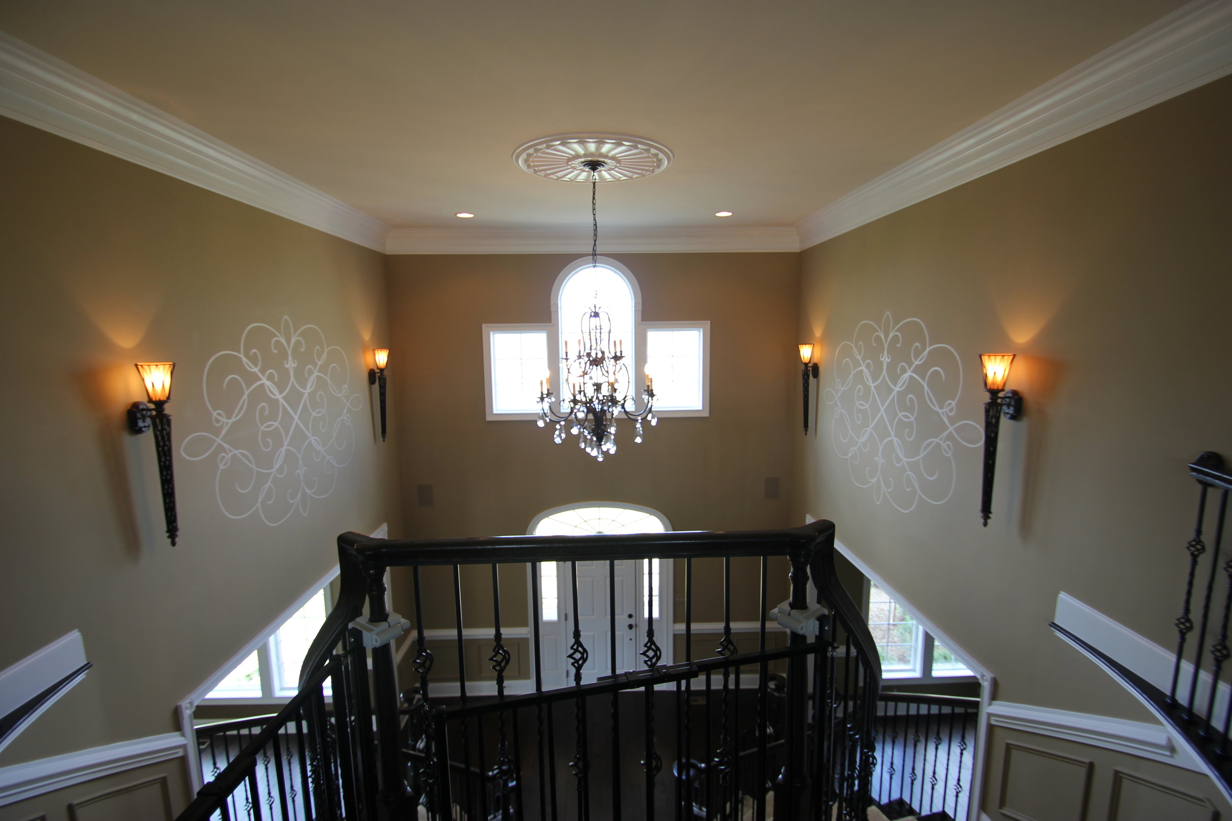
And finally here are the medallions painted in the foyer to enhance the space and pick up on the scroll designs on the chandeliers.

2012-04-24_14-21-17_268

2012-04-24_14-21-17_268

Progress shot of setup and transfer of design

IMG_0869

IMG_0869

IMG_0871

IMG_0871

Completed space.

Thanks to the clients for a great opportunity!

A first for me

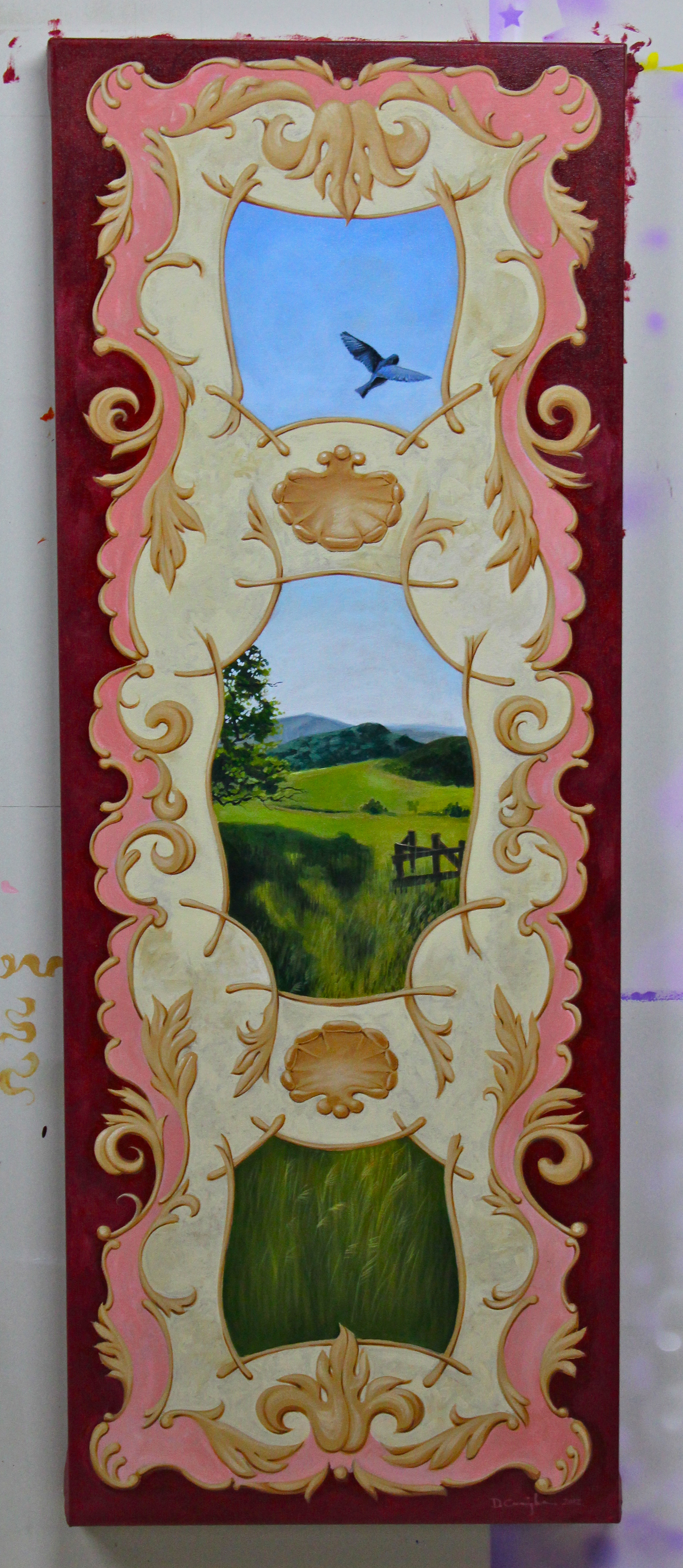
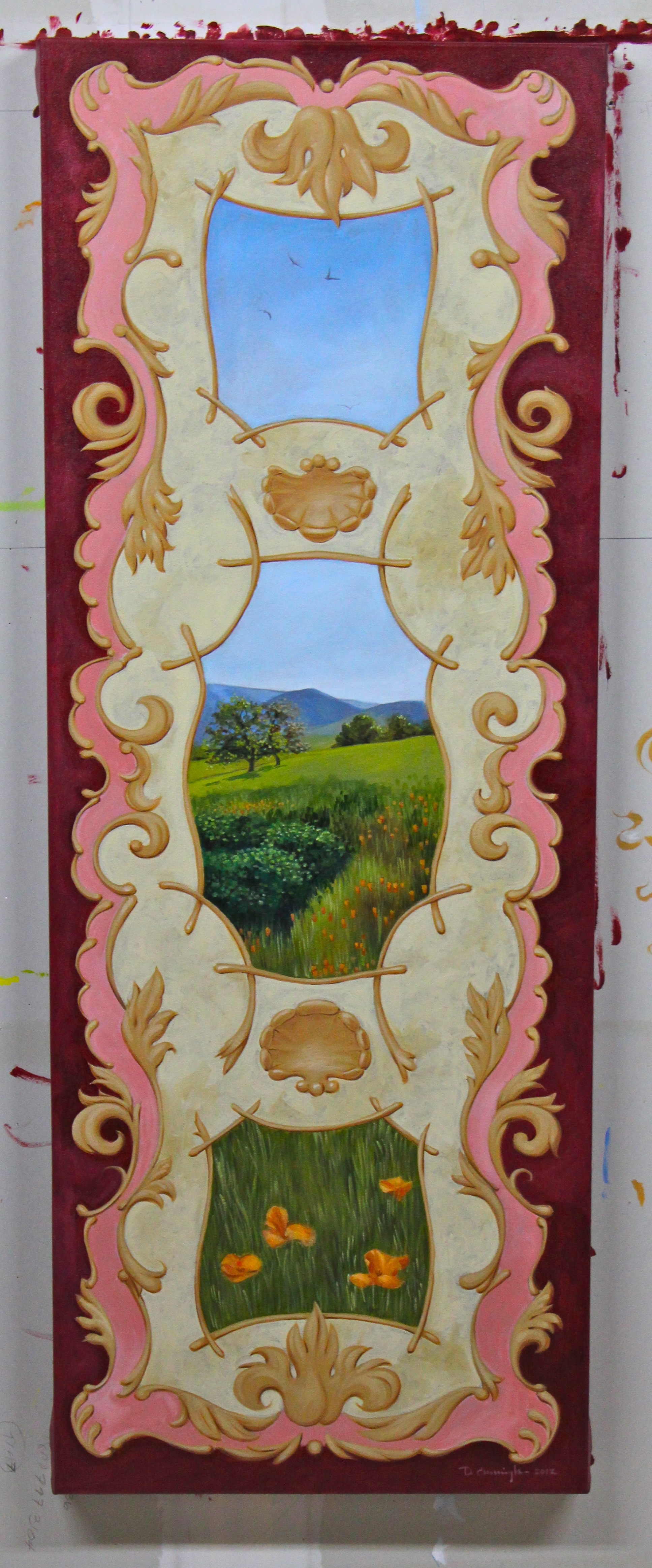
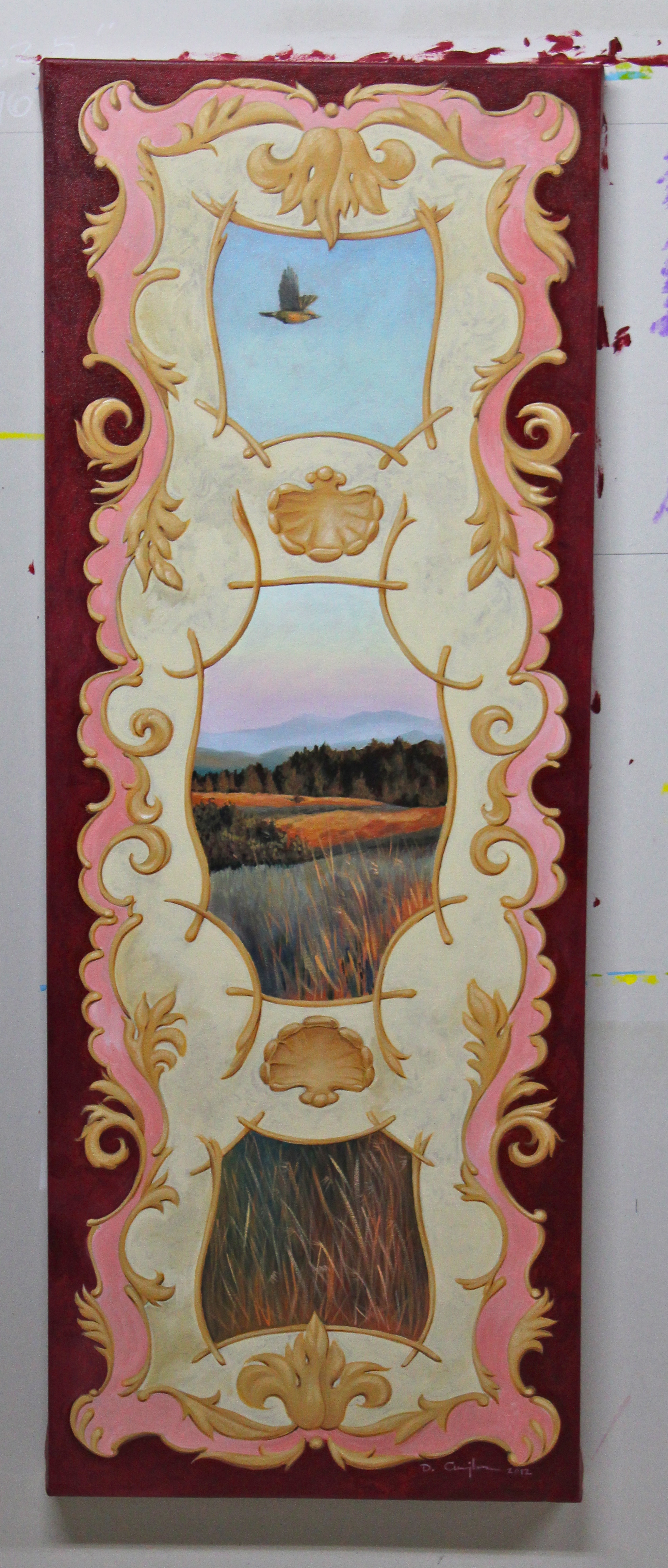
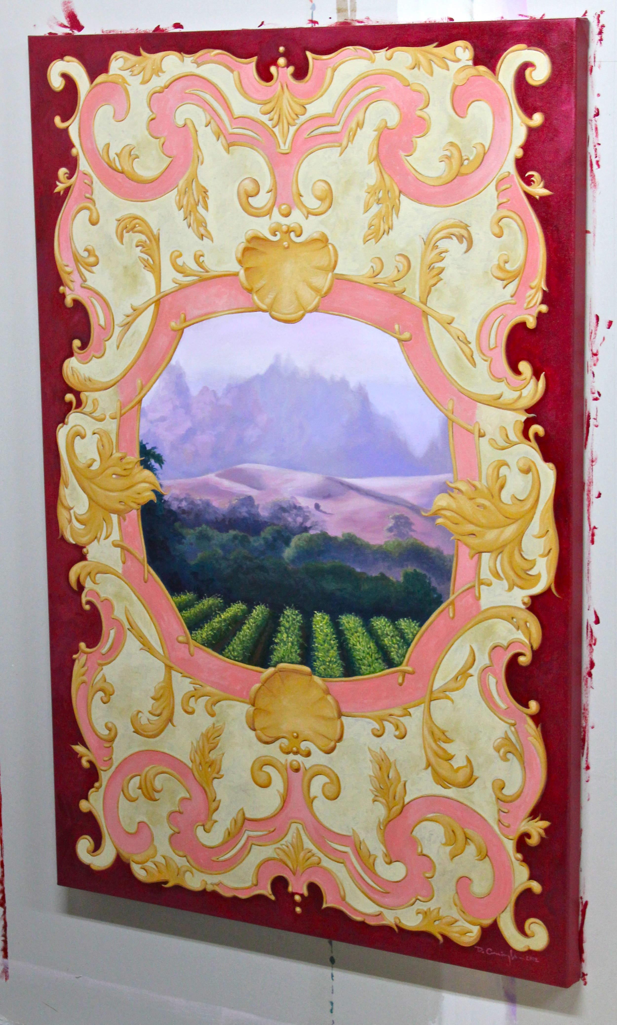
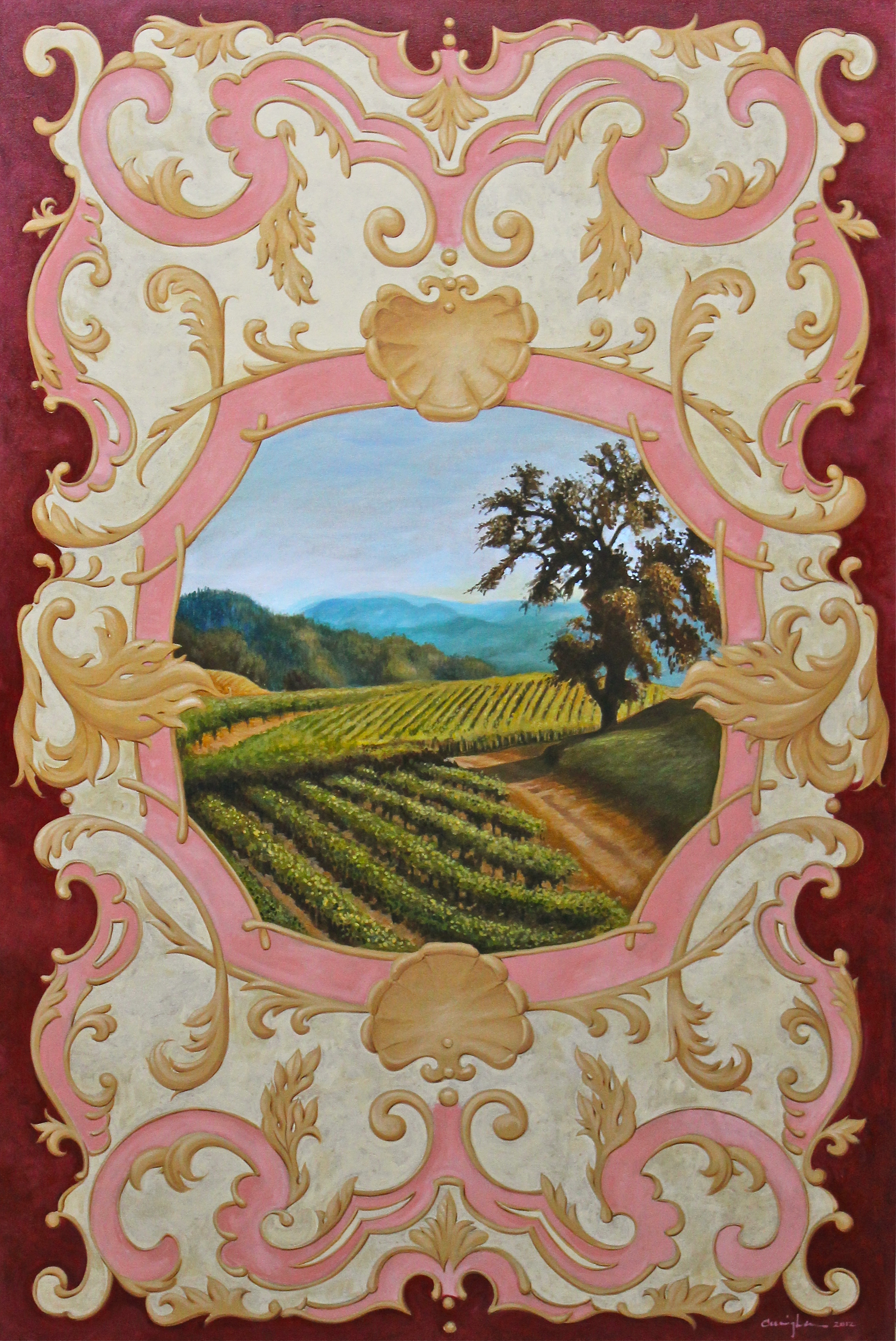
UPDATE: Here are my panels. I can't show you the room because you have to GO SEE IT! But I wanted you to see the whole grouping.

About two years ago I took a class in Connecticut with the amazing grotesca artist Carolina D'Ayala Valva.  Ever since I have been hoping for a project where I could use what I learned.  This is that project!

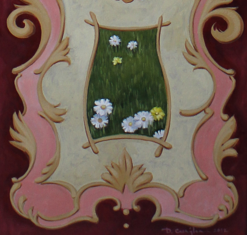
I just finished 8 panels for this year's BSO Decorator Showhouse's dining room and I feel exactly that. The room is being designed by Paula Henry of Simply Put Interiors.  The panels are based on 18th century Baroque and Rococo decorative ornamentation with scenery in each.  I'm not going to spoil the reveal because I really want you to see them in person, so I'm giving you a before shot of the room.  You need to see this and all of the spaces completely transformed by all of the talented designers.

IMG_0553

IMG_0553

For more information on this year's showhouse click here.

Being involved with 7 previous showhouses, I believe this one will be one of the best.  The house is in Loch Raven, on rolling acres off Cromwell Valley Road.  The house was built in the 1950's and visitors will be able to relate to the well proportioned spaces and see how they can take elements away to use in their own home.

I will be posting pictures of the evolution of this space along with the process photos of the panels after the house opens.  I hope to see you there and look forward to your feedback! (here's a teaser of one of the panels...severely cropped as to not to give much away!)

IMG_0742

IMG_0742

Also, I have updated my website with a new tab under galleries called "Available Pieces" for items that are for sale. If you see something you are interested in, contact me!

Coming up in my next post, my current project which consists of woodgraining beams, some faux and plaster ceilings, and some decorative painting.

IMG_0539

IMG_0539

The Big Three

lockers 1

lockers 1

locker baseball

locker baseball

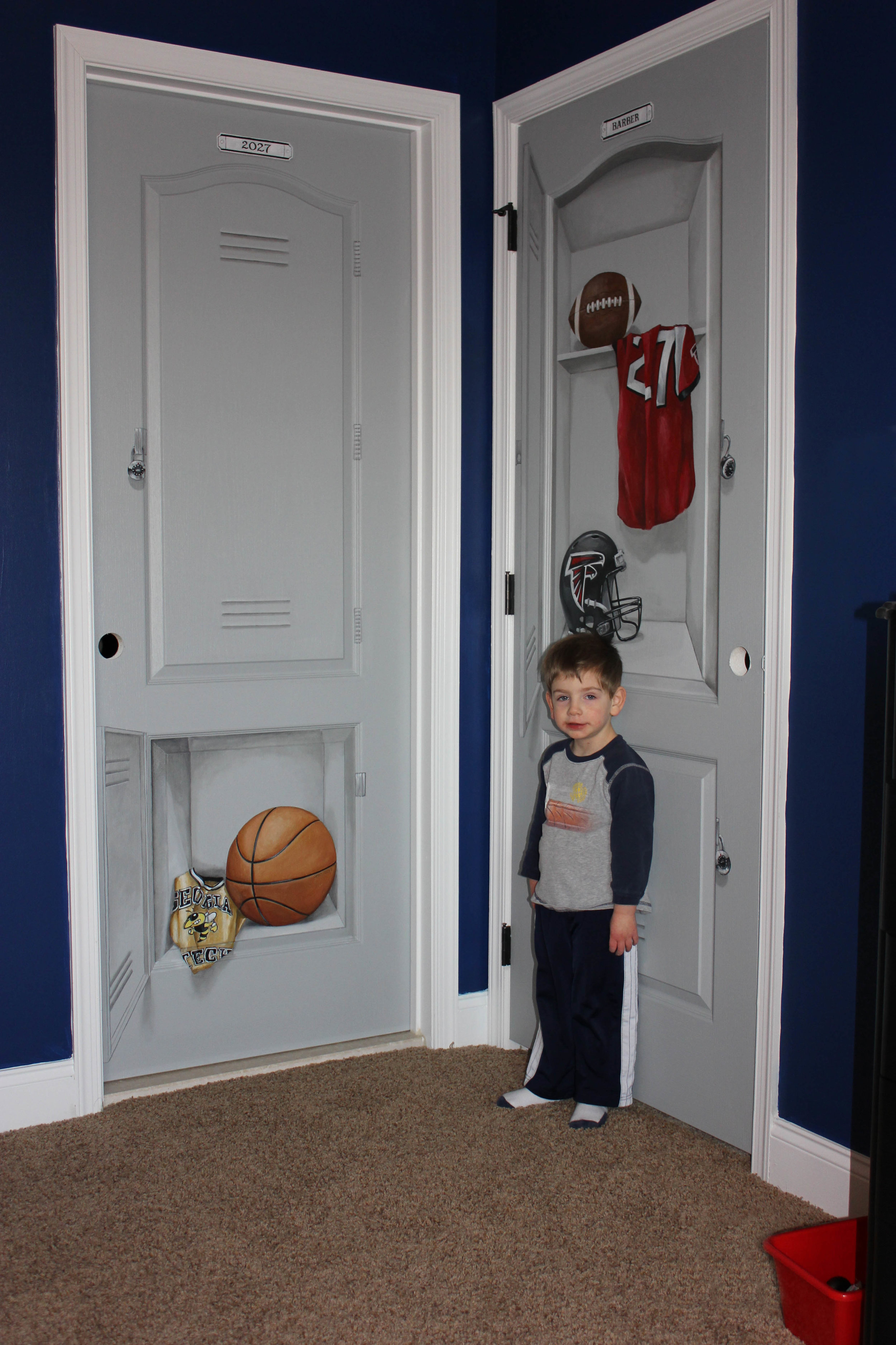
Just finished up some doors for a little boy's room.  The client wanted the doors to look like lockers with their favorite teams featured in each one. No convincing them of going with Baltimore Teams. They were awesome clients so I had to forgive them.

lockers basketball

lockers basketball

lockers football

lockers football

jeremy with lockers

jeremy with lockers

Thanks to Lisa Bower of Madella's Decor for the referral!

Also, DON'T FORGET!! Budeke's Timonium is having a faux event this coming Thursday!! Please make sure you RSVP by TOMORROW!! Hope to see you there!

Faux Finishing is Dead.

What do you think of when you hear the word “FAUX?” Does it give you thoughts of your friend “fauxing” her living room with a sponge and some pukey yellow paint? Does it remind you of that crusty brown “Tuscan Old World” mess on your neighbor’s wall?

How about if I told you that “faux” in today’s interior design is alive and well if you know where to look.

Since being in this business I have had people say to me “Oh, faux? My sister used to do that. Isn’t it called ragging?” or “I don’t like faux, its so passé.”  Then I get to show them my samples and they say “That’s faux?!  It looks like _____!” (Insert something like leather, wood, marble, fabric, etc.) Unfortunately many people I’ve met associate the term faux with ragging or sponging which are in fact foundation techniques that are used to create more complex finishes but have become synonymous with dated d-i-y walls. They are unaware of the magic a trained and experienced decorative painter is capable of with a can of paint and a few creative flips of the brush.

At last year’s BSA Decorator’s Showhouse in Baltimore, I had the pleasure of working with Paula Henry of Simply Put Interiors on the “Suite Retreat” master bedroom.  (This year's is in the works!) She and I came up with a finish for the walls that replicated the look of wallpaper.  One day when Paula was attending her room, a visitor came to her and asked about the “wallpaper.”  Paula told her that the walls were faux finished but the visitor insisted that it was paper.  Paula told the lady that she was there when they were being painted so they were in fact faux. The lady still didn’t believe her.  I laughed out loud when I heard that!

Suite Retreat

Suite Retreat

Good faux painting is undetectable. Unless you have a trained eye (and sometimes hand) to discern the surface, most people walk right by without a second thought.  Another example: I was at a home show a few years ago where I had a panel that I wood grained to look like mahogany. I literally had to stop people and say, “That’s not real, it’s painted.” And they would look at me like I had two heads.  I certainly got a kick out of their reaction.

door wood

door wood

Today’s “faux” is simply a reincarnation of ancient methods. If we look at the term “faux,” it translates from French meaning “false.” These techniques started as a form of replicating materials such as marble, wood, and other natural surfaces with paint; but in our age has come to encompass many other decorative finishes for walls, furniture, and other surfaces.  Faux finishing has been used for millennia, from cave paintings to ancient Egypt but what we generally think of as faux finishing in the decorative arts began with plaster finishes in Mesopotamia over 5000 years ago. (http://en.wikipedia.org/wiki/Faux_painting)

my bathroom

my bathroom

Old finishes don’t die; they simply get updated with materials, color schemes, or chemistry.  Lately wallpaper is all the rage and rightly so.  There are beautiful colors, patterns, textures, and sheens, all which fly in the face of the now dated old world plasters, textures, and other faux finishes.  But what’s interesting is that most of the papers I see I say to myself, “I can do that with paint!” The best thing is that I can do that in the EXACT color and scale the client needs – i.e., the client is not limited to what’s on the wallpaper. The best decorative artist can see a surface and will be able to dissect the finish into its elements. Stencils, metallic paints, glass beads, or plasters; these are all just materials.  Its what the decorative artist does with these materials that develops into a timeless or trendy finish, whatever the client wishes.

IMG_0560

IMG_0560

potomac cabs

potomac cabs

So what does this mean for you? Well, let me give you some examples.  When you have a surface in your house that has seen better days you may think about replacing it rather than saving it.  Painting kitchen cabinets are much more economical than ripping out and replacing them when done correctly.

Glazes can transform an otherwise boring drywall and molding ceiling into a mahogany masterpiece.  A builder’s grade white fireplace mantle can be painted to look like carved marble. Grandma’s buffet can be updated to the 21st century. Want a tile backsplash but can’t find the perfect tile that matches your granite? Paint it.  Want to tie together two disparate rooms? A perfect artistic finish will do the trick.

IMG_0276

IMG_0276

Part of being an artist is to show people how art can enhance their every day lives and environment. Faux is just one way of achieving that goal. It is not simply ragging or sponge painting either.  It’s a way to bring interest, or subtlety, or impact, or all of the above to your environment that you will love for years.

Faux isn’t dead, its hiding in plain sight.

A Fresh Coat of Paint

china cab before

china cab before

Recently, April Force Pardoe, principal of AFP Interiors contacted me to see if I would be willing to tackle this china cabinet. She had found it at Habitat ReStore in Halethorpe. Upon closer inspection it was in great shape and just needed to be freshened up.  The client wanted something hip and so she and April decided on Turquoise! My favorite color!!!!

IMG_0166

IMG_0166

(Pardon the quality, Ill be going back to take good pictures)

I used some Annie Sloan Chalk Paint and custom tinted it to match the Sherwin Williams color they had chose.  It was delivered yesterday and the client sent me the most heartwarming email thanking me.  Thats what its all about!!

Thanks April and Shayla!