Jumping in Head First; An Art Piece Like No Other (for me at least)

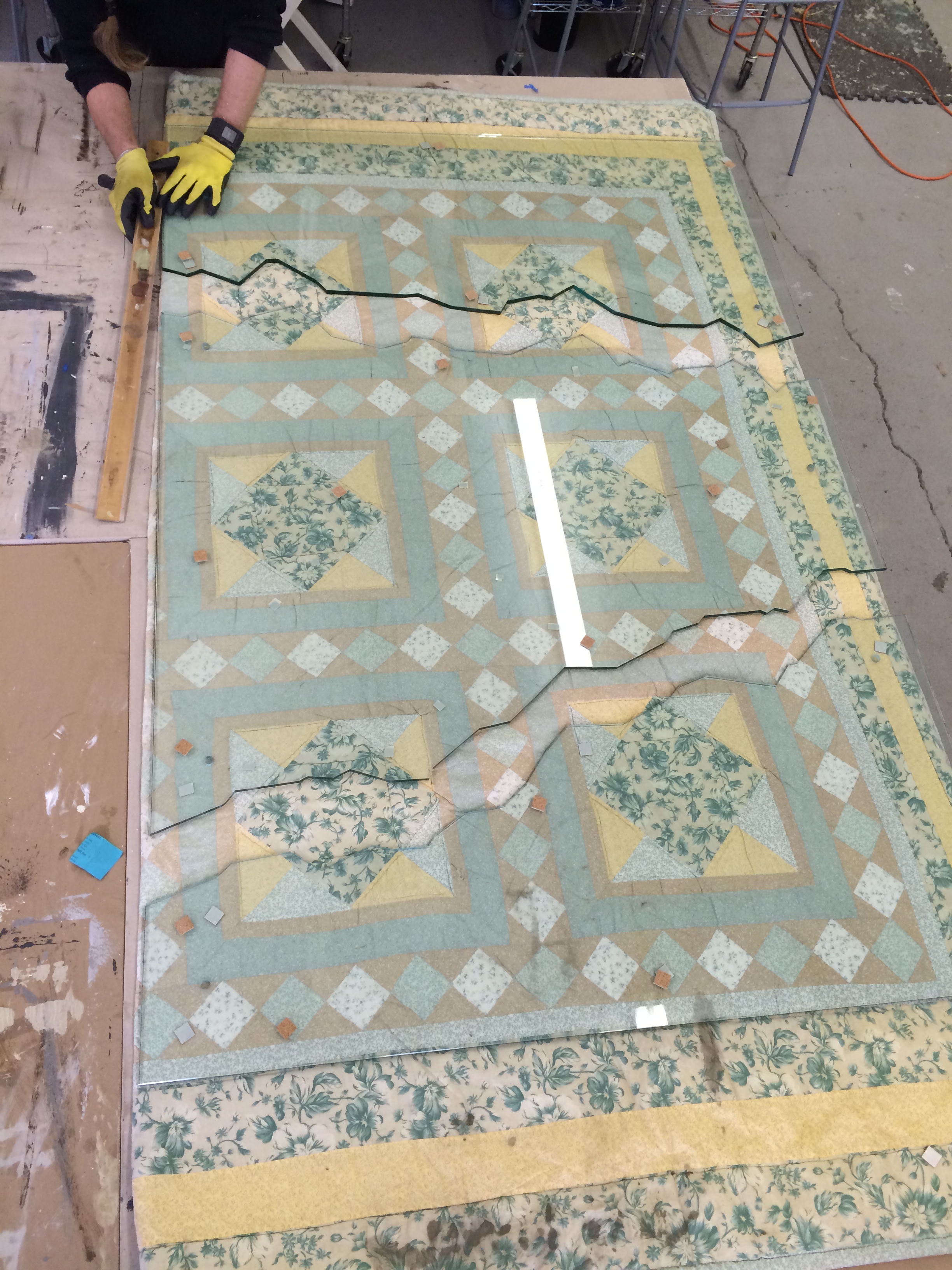
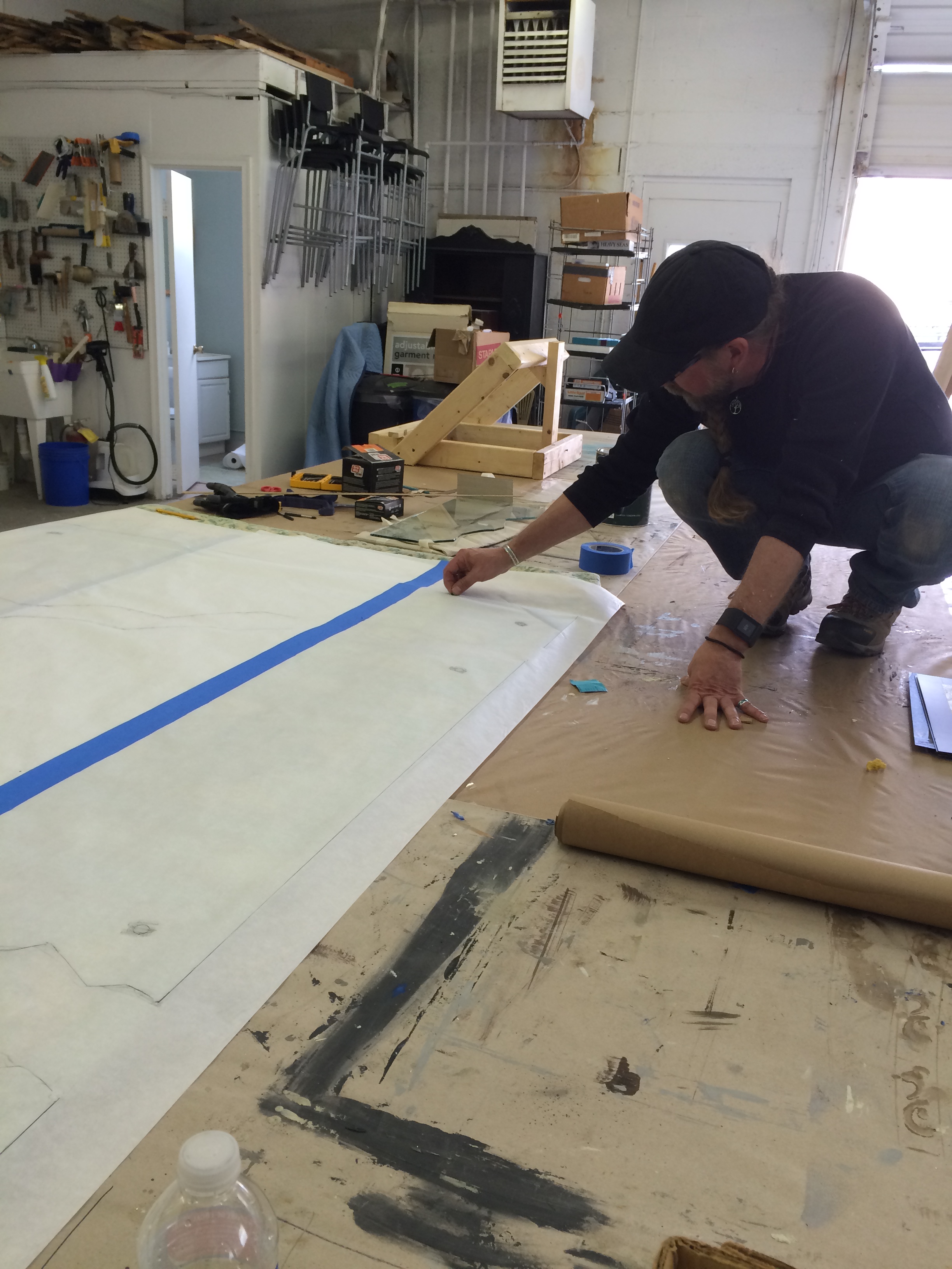
When I proposed this project almost two years ago I had not a clue as to who what I was getting myself into. My client, referred to me by Wendy Appleby, has lived in this house for over 20 years and hadn't figured out what to do with the giant overmantle that loomed over the front room. She is a collector of great art and owns a few Picasso's, Chagall's, and Matisse's. She also collects glass and so when I proposed  that we do an abstract glass piece she was sold. "Great!" I thought, then "What the hell did I just say I would do??" Paper template for glass
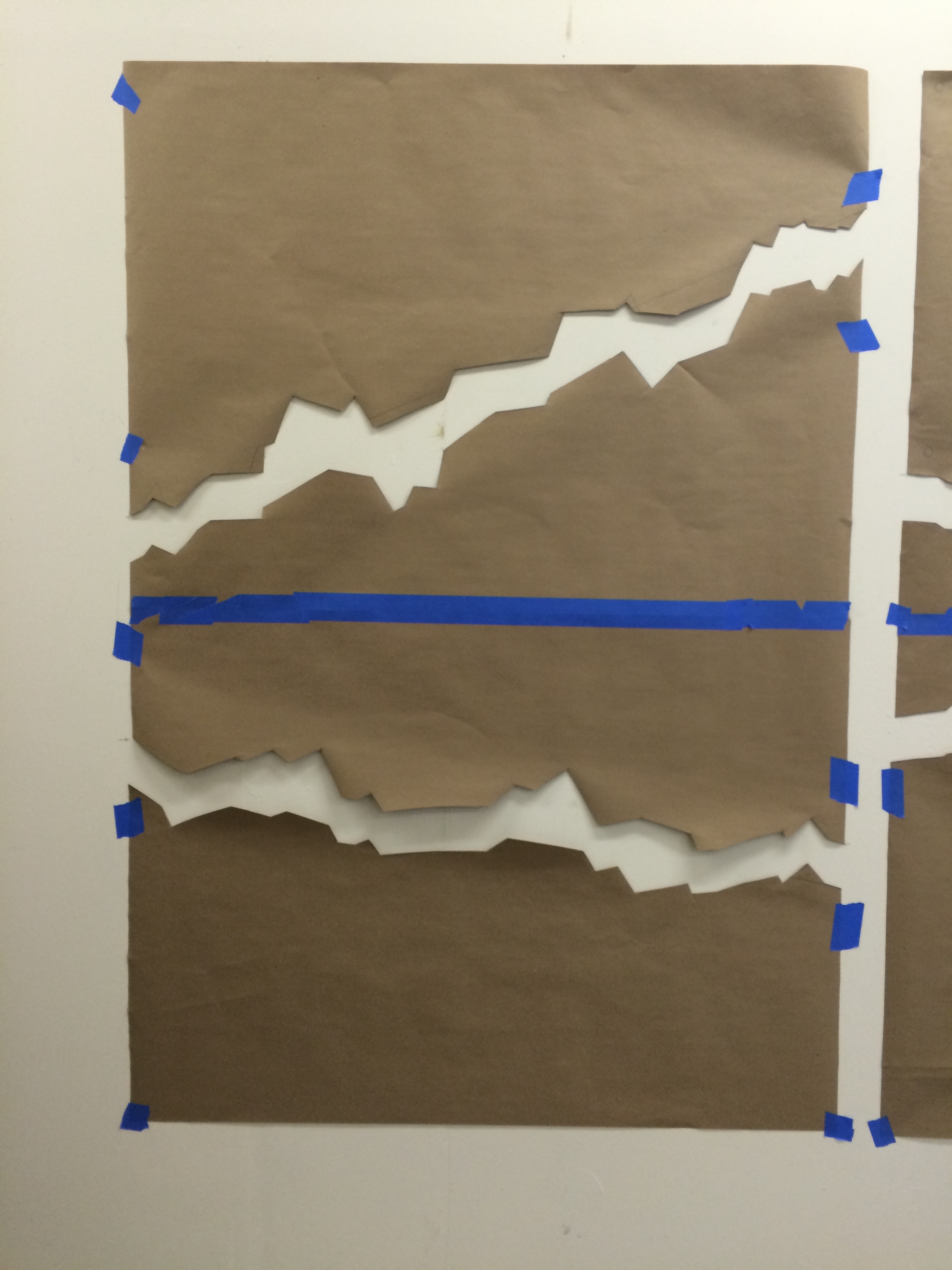
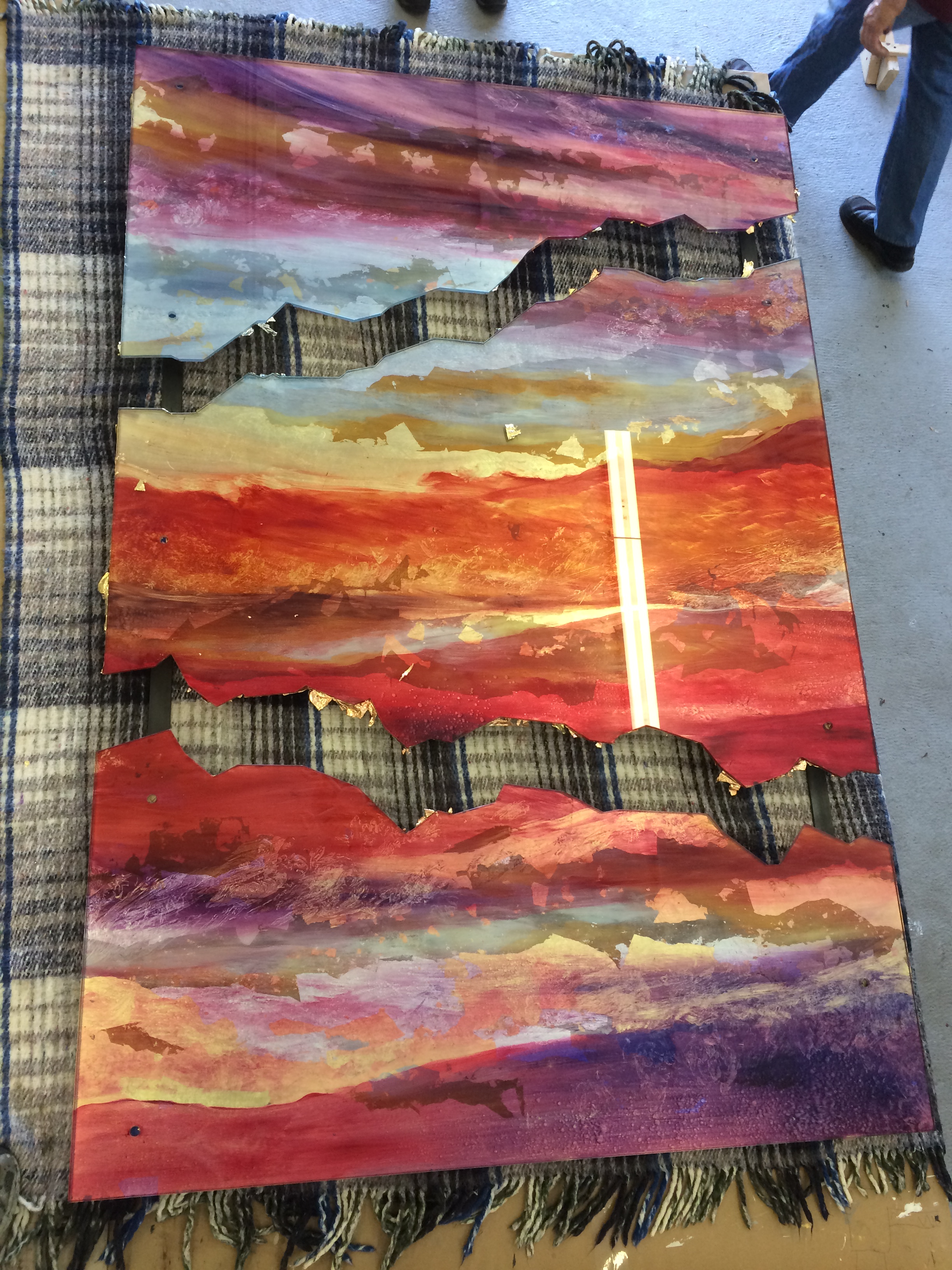
The first thing was to figure out if the glass could be cut in the way we wanted. I went to several places but the only folks who could help me out were Sherry and Len Berkowitz from Great Panes in Old Ellicott City. They had the glass water jet cut to my template. I was stoked that they were able to help me out. Its also nice to be able to use the talents of friends.

IMG_2274

IMG_2276

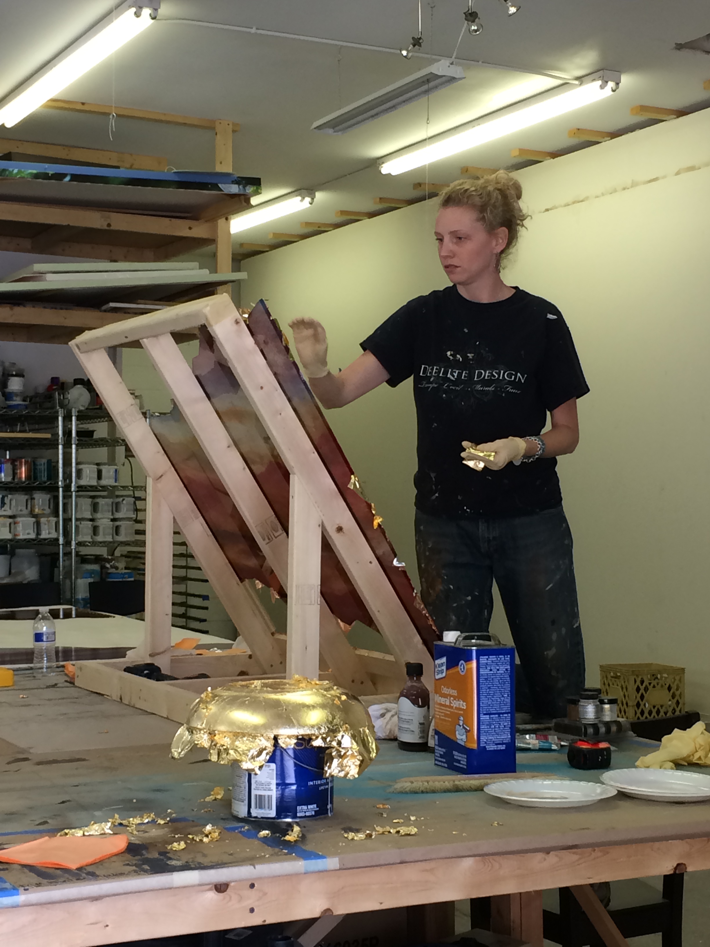
So on to the next task of figuring out how to go about executing what was in my brain. Enter my friend Annie Lemarie, an expert at gilding. I took a trip out to her house in Sharpsburg and spent the day playing in her studio. She lives directly across the street from the Antietam Battlefield, a beautiful setting for a fun filled day. We figured out the method of application of colors and metals, an oil based paint would suffice.

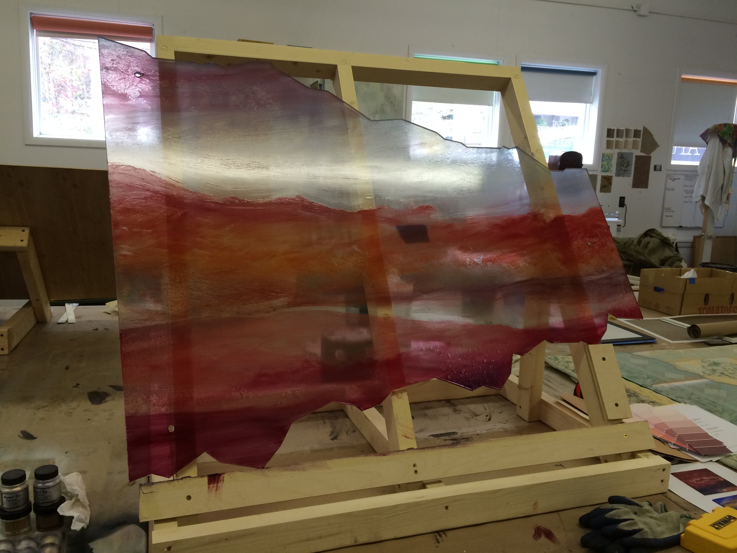
Back to the studio and my friend Ewan Tulis constructed this easel that would serve to allow me to study the front as I was working along. I had to work on the back, a technique called "reverse painting" or "reverse gilding." I was essentially flying blind with the first layers of color. It looked so awful until the leaf and mica powders were applied. Then the whole thing came to life.

IMG_2319

IMG_2354

IMG_2356

IMG_2362


IMG_2398

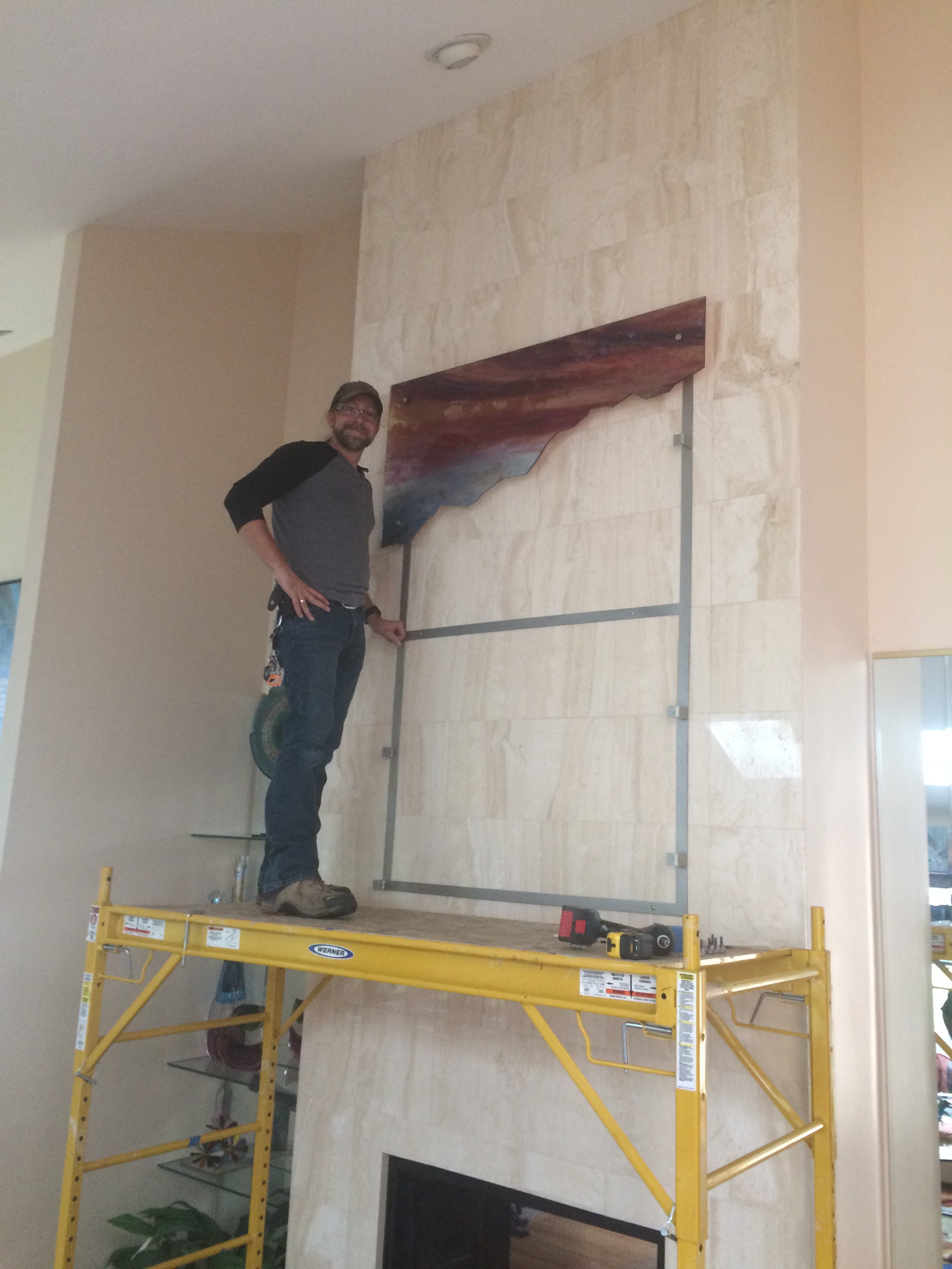
Finally, the last task was mounting it. Bill Knapp, yet another friend, who works in found object metal sculpting, built an armature that would allow the glass to be suspended from the wall as if it were floating. It was heavy and would be hung on a travertine tiled wall. We couldn't really figure out where the studs were so we hoped that when the client decided she was going to replace the wood burning fireplace with a gas insert that we were going to be able to look up inside to see where we were going to tap in. Luck was not in our favor but thankfully the way Bill made the armature, our pilot holes would be covered over.

Ewan doing his thing

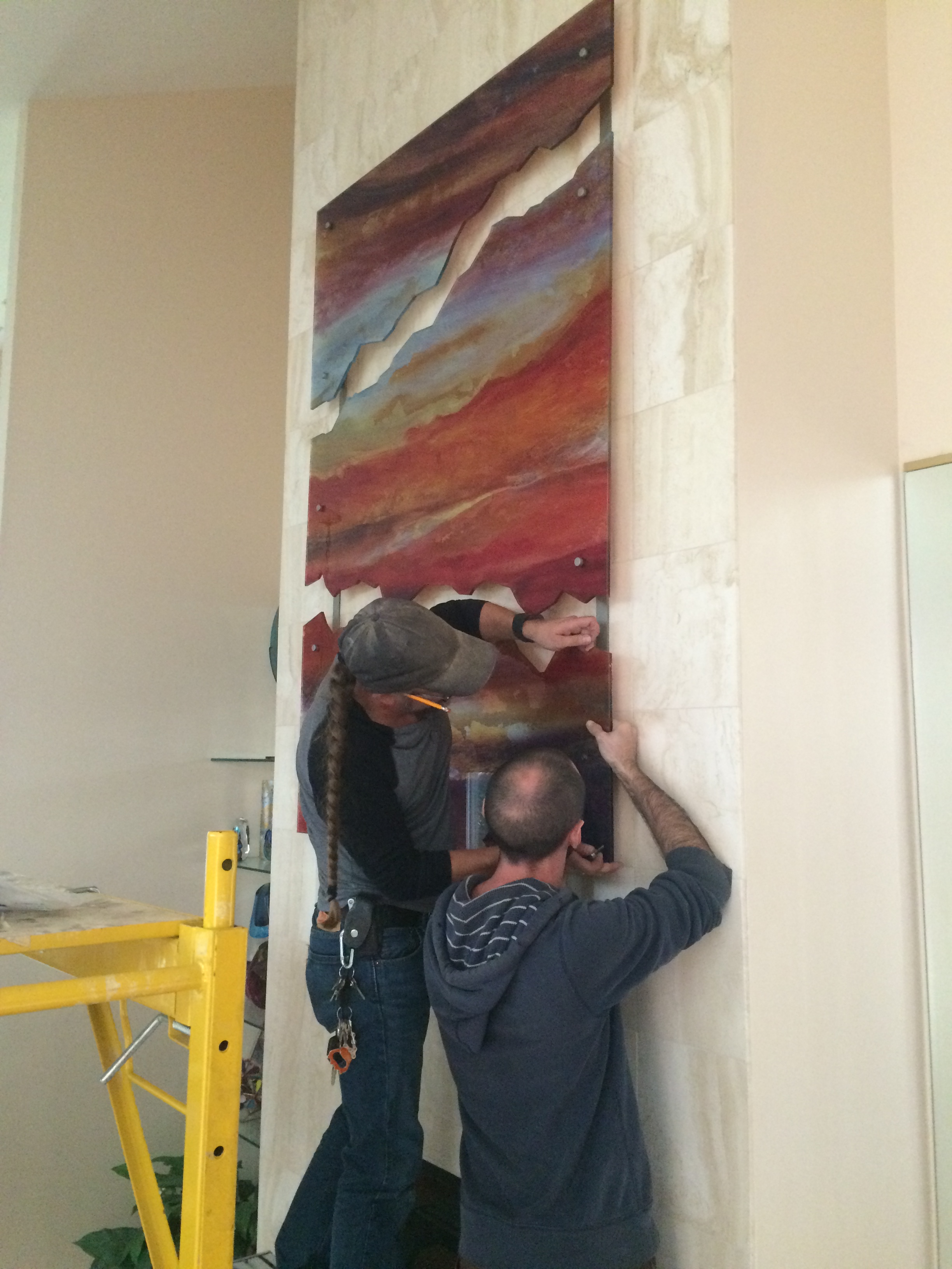
Finally! The day came for it to be installed. Ewan and his assistant Matt worked smoothly and professionally to place my work perfectly over the fireplace. It was such a treat to see it in its place after so much planning and work.

Ewan and Matt working on installing the final piece.

IMG_6716

IMG_6722

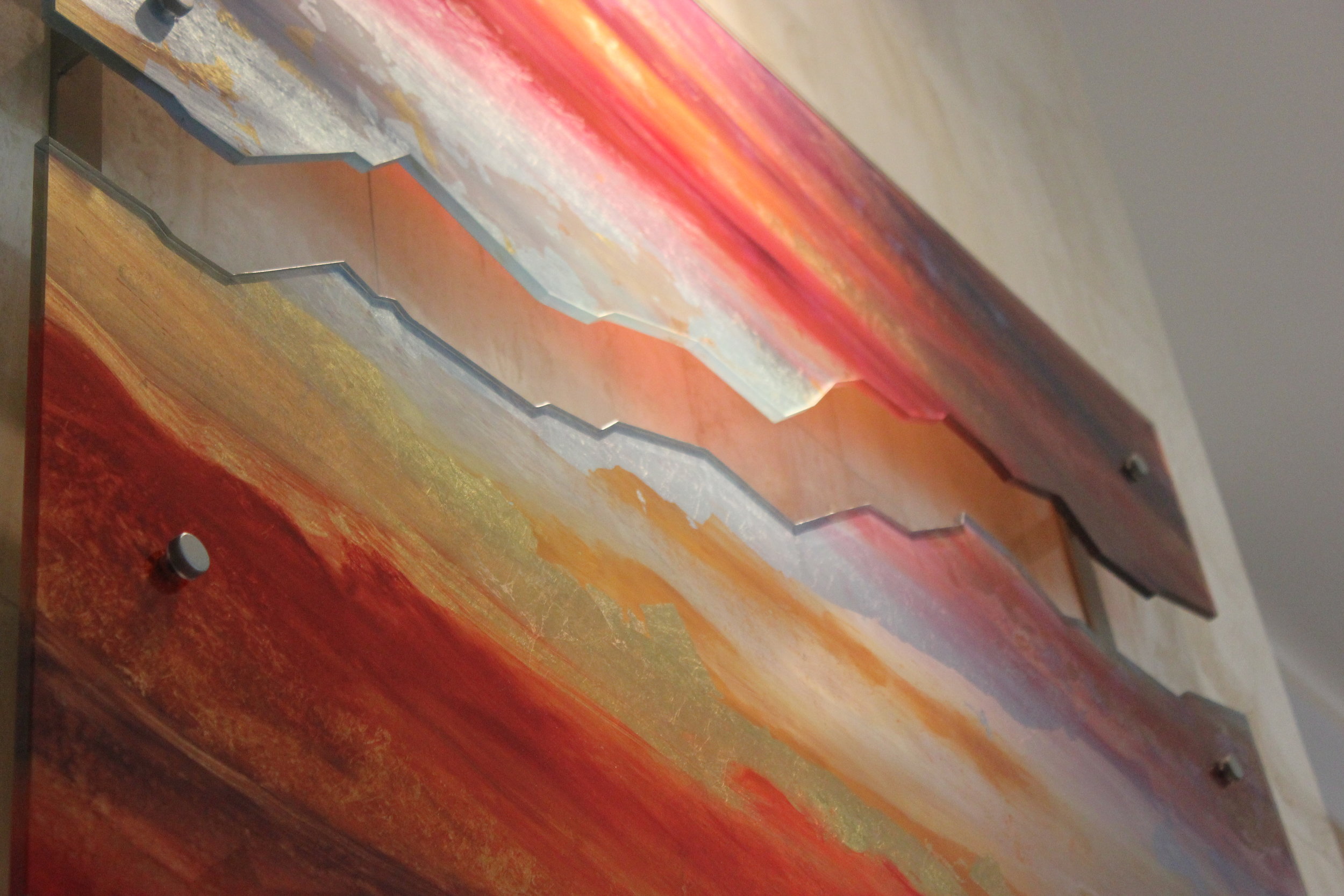
The best compliment came from my client when she said, "That's cool as S***!" I laughed out loud. The icing on the cake was an email she sent that evening. "[My husband] walked in the door and saw the painting and his comment was "spectacular"! He sat down on the sofa, stared at the painting and said to tell Dee the painting was well done. The funniest comment he had was that it is a lot more colorful and stands out more than what we had before. I laughed and told  him I sure hope so because there was nothing on the wall before. It is truly am amazing piece of art!"

That makes me happy.

Raving about the Ravens

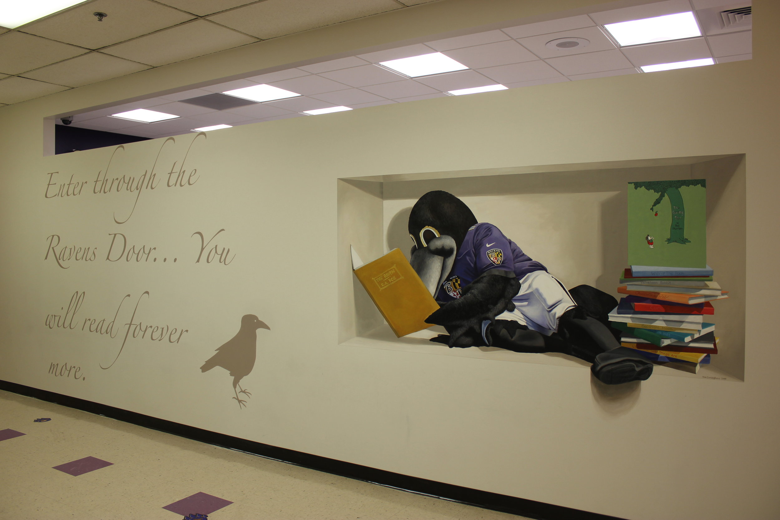
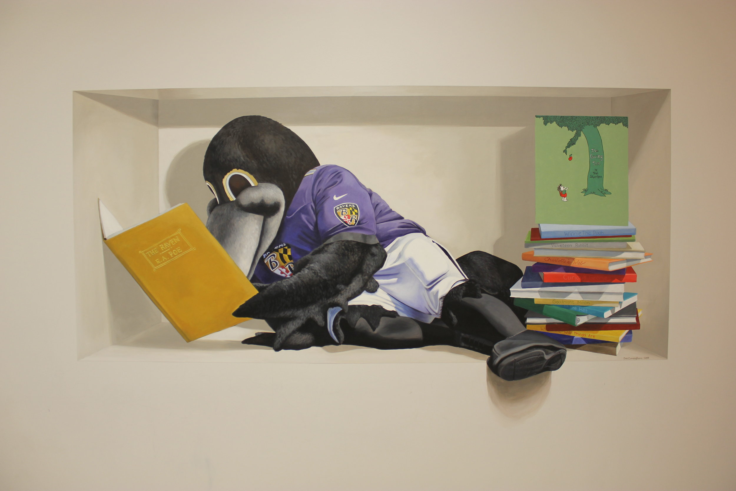
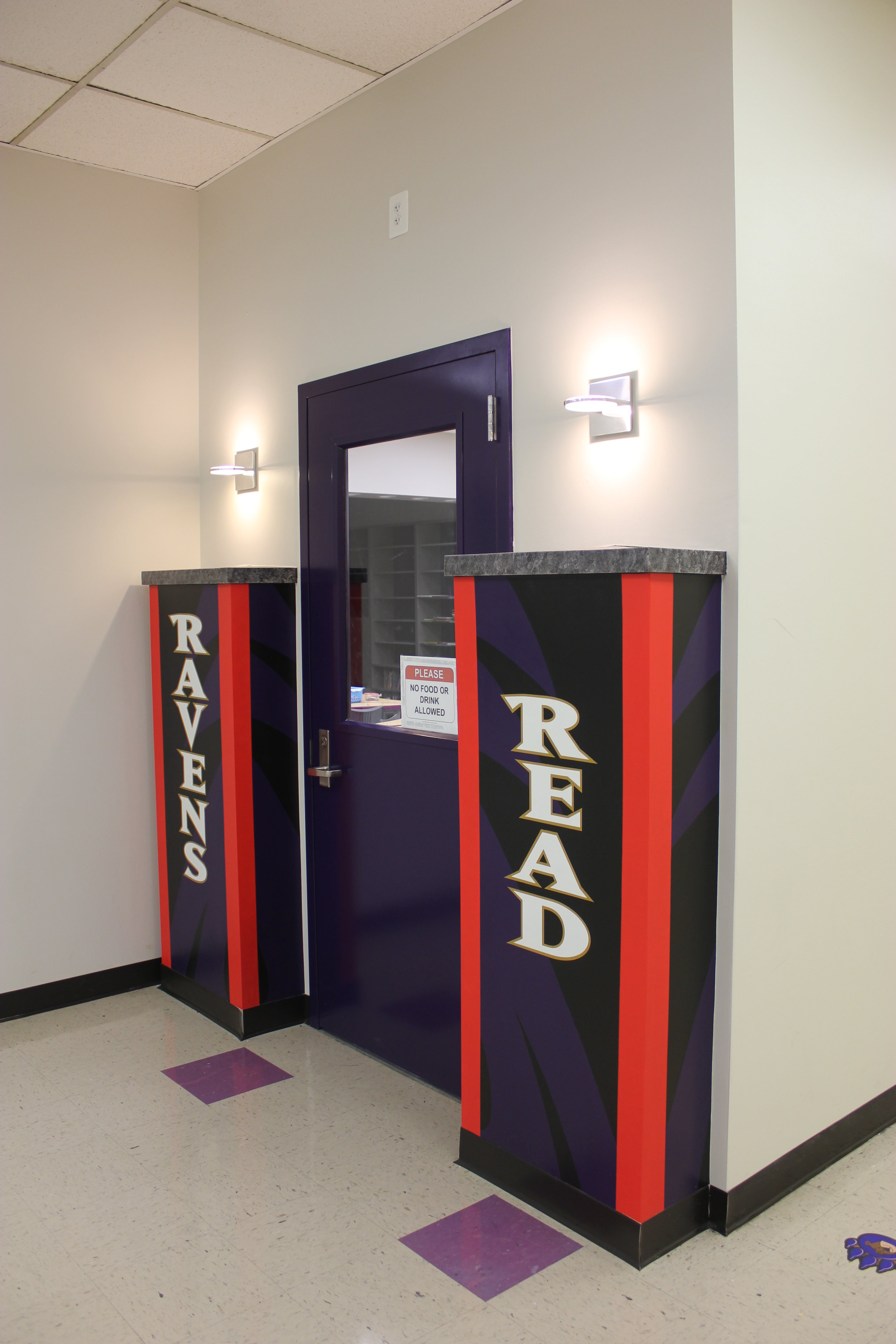
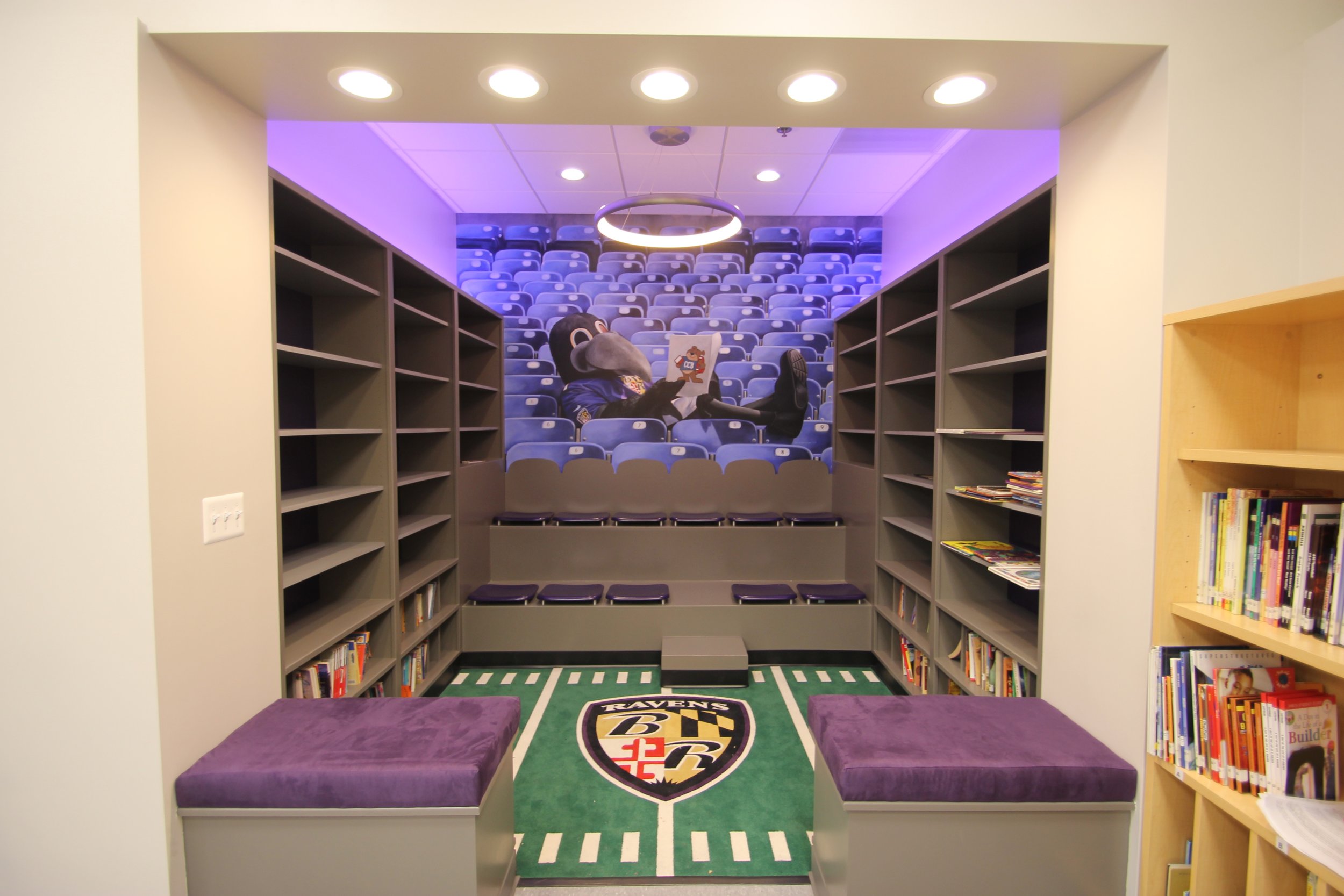
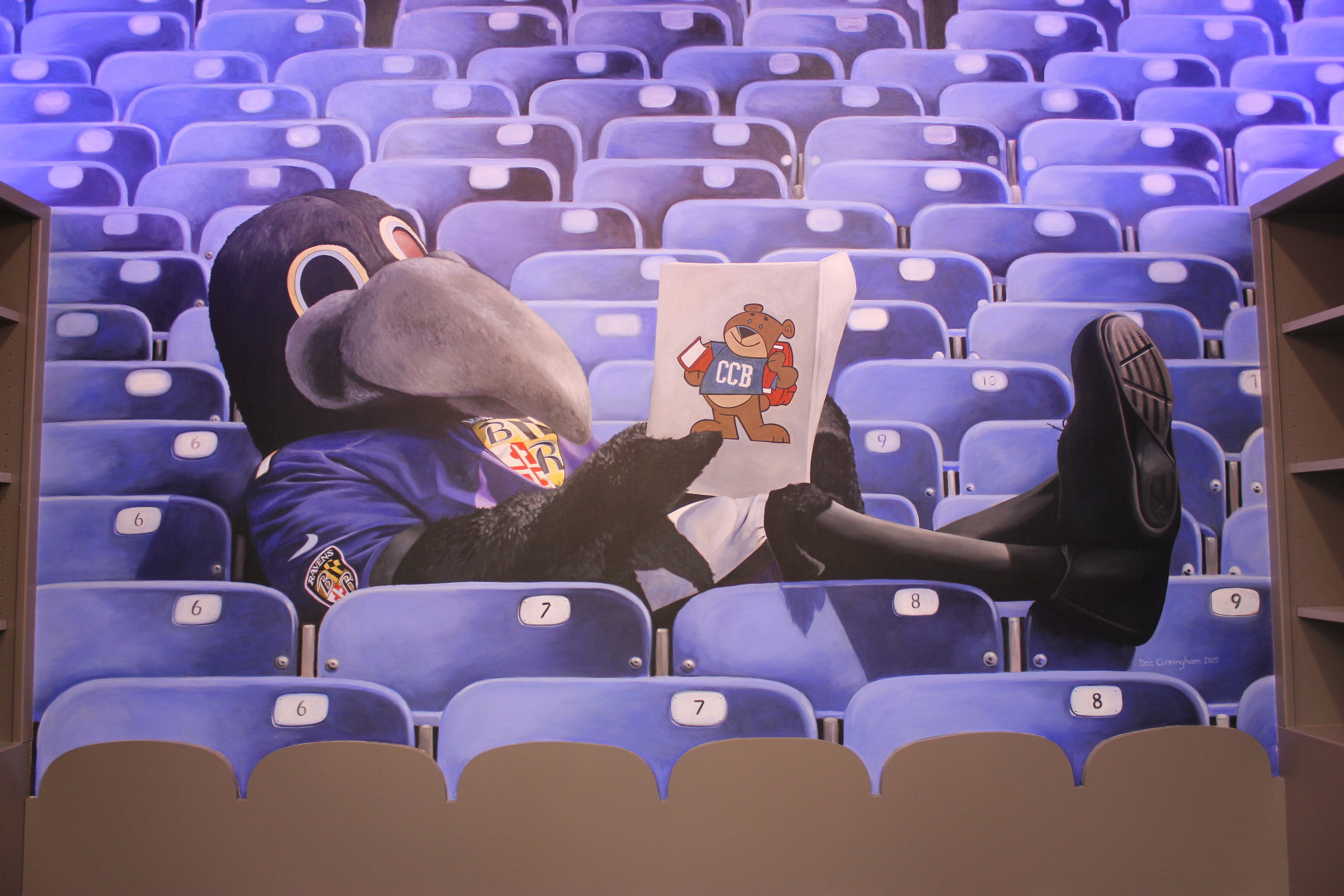
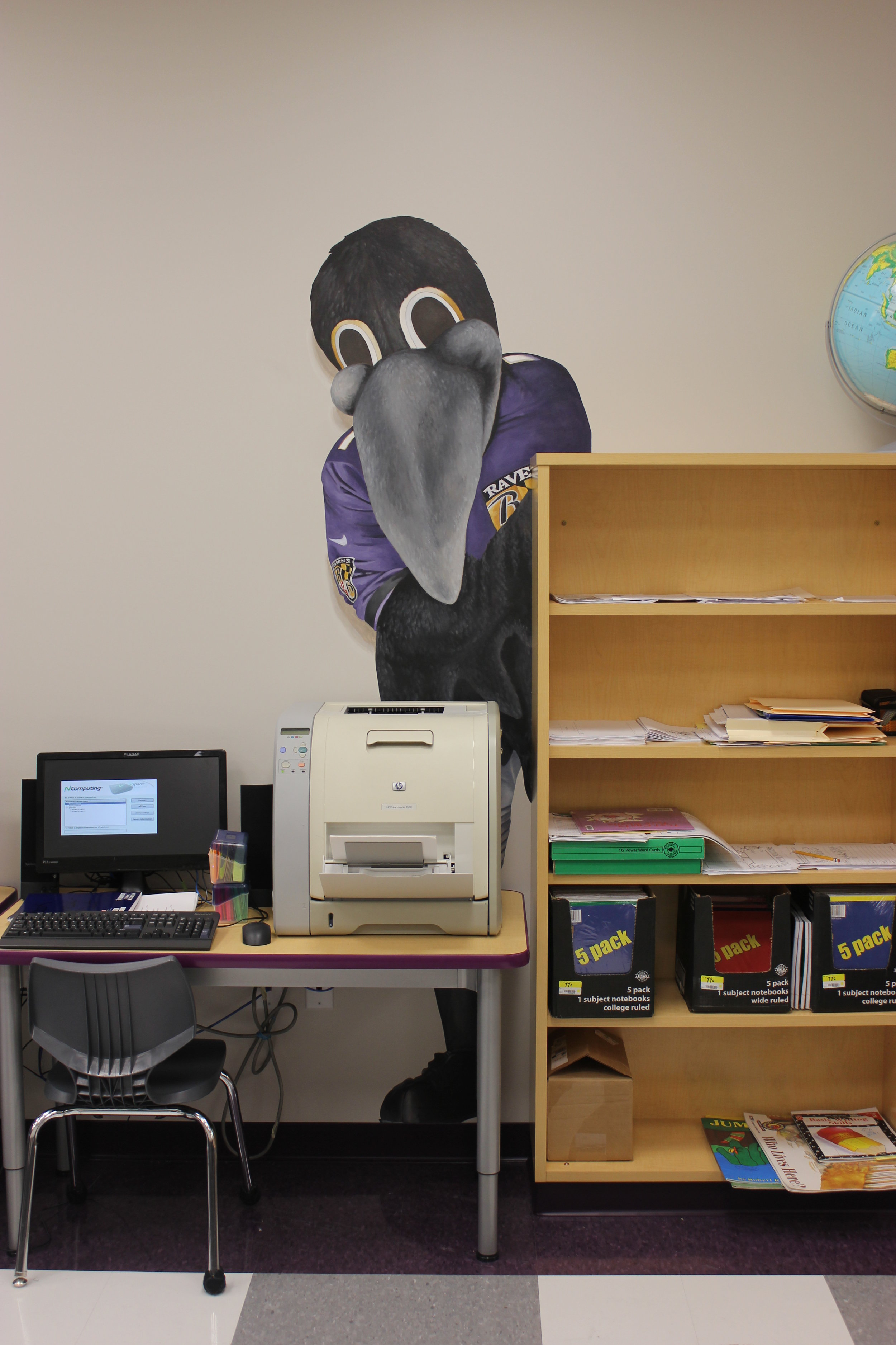
IMG_6692 Recently I was asked to paint some murals for a library renovation being funded by the Ravens Foundation for Charles Carroll Barrister Elementary in Pigtown, Downtown Baltimore. I was thrilled! I was able to paint four areas, all on canvas, and help create a warm and inviting environment for the students of CCB to read and learn. Special thanks to Nancy Pascale and Warren Wunder for having faith in me to accomplish this project in such a short amount of time. And special thanks to Mary Landavere for helping paint all those stadium seats! Oh, and I can't forget Shelly Wilkins and Larry Stroup for their work hanging the murals.

IMG_6690

IMG_6694

IMG_6701

IMG_6697

IMG_6699


Never Say Never

IMG_2131

IMG_2131

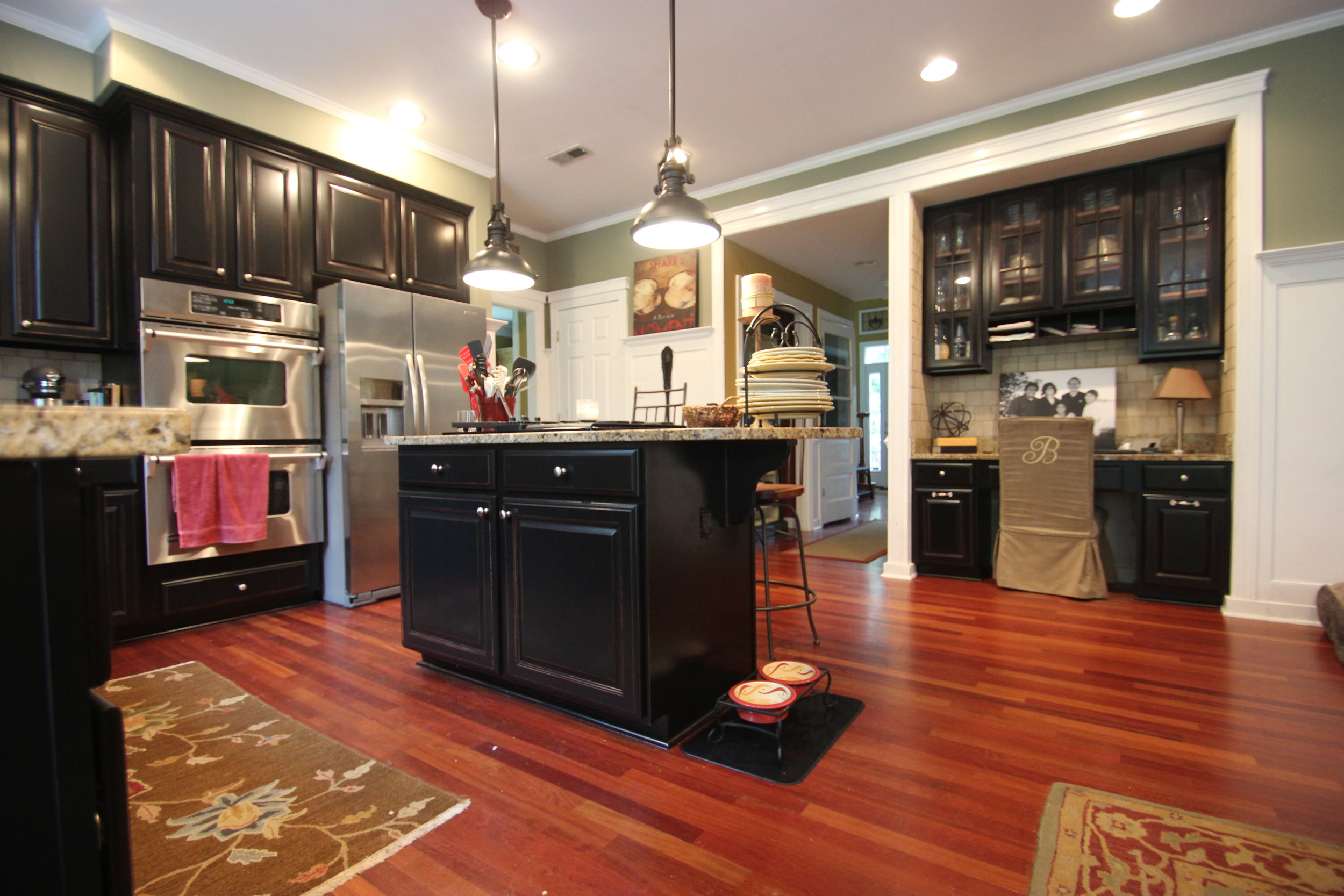
Yeah, well...so I said I'm done with painting cabinetry. Its tedious, difficult, smelly, sweaty, and dirty. BUT after figuring out the nuances of my new system I think I'm ready to go again.  I decided to try out a new sprayer and use lacquer after hosting the Faux Team's class at my studio. You can read about that here.

I hit a few hiccups along the way. The first was getting to know my new sprayer. With a little help from a friend I was able to get up and running. Then I didn't realize HOW MUCH paint you had to use just to get the hose primed! Then something went "fishy" with the paint on the doors. Turns out there was a certain cleaning product that was used on them and it repelled the paint. Mind you I had SCRUBBED these doors well with TSP and wiped them clean then sanded and wiped clean AGAIN but the problem persisted. The only solution was to keep layering thin coats of paint and sanding back between each coat followed by a wipe down each time with Xylol.

IMG_2380

IMG_2380

After the doors and drawers were completed it was time to tackle the kitchen itself. It took about two days to fully mask everything off. My intern's back was out so I was on my own. But once that was finished the spraying was cake. Not as many issues on the boxes so thankfully this portion went much more smoothly.

IMG_2566

IMG_2566

IMG_2568

IMG_2568

Re-installation took about a half day and the results are stunning. I will never use anything else on cabinetry. The feel and durability of lacquer far outweighs the extra time and effort of setting up and spraying it, as well as the smell. It looks so professional.

IMG_6406

IMG_6406

IMG_6404

IMG_6404

IMG_6396

IMG_6396

IMG_6395

IMG_6395

So....the clients have asked me back to do some other areas of their home. Never say Never!

Adventures in Portrait Painting

Taking classes to continue my personal artistic growth is something I always love doing but finding the time (and money) is difficult. Last month I took the third class offered in William Cochran's Trompe L'oeil Mastery Program- Portraiture. Each time I take a class with William I find that take away something that doesn't present itself until later. The immediate return is usually that I suck and I should hang up my brushes. However, after a few weeks the information absorbed at the time somehow begins to come together. Our first day was revisiting color theory. Elementary as it may seem, there are hundreds of pigments and we each chose a palette to work from. My colors were Hansa Yellow Opaque, Phthalo Blue Green Shade, and Pyrrole Red Dark. Adjusting for the intensity of the pigments, we each created a value scale moving through each color as well as across the wheel through neutral grey. Once complete, we began the portrait workshop in earnest.

IMG_2428

IMG_2428

IMG_2430

IMG_2430

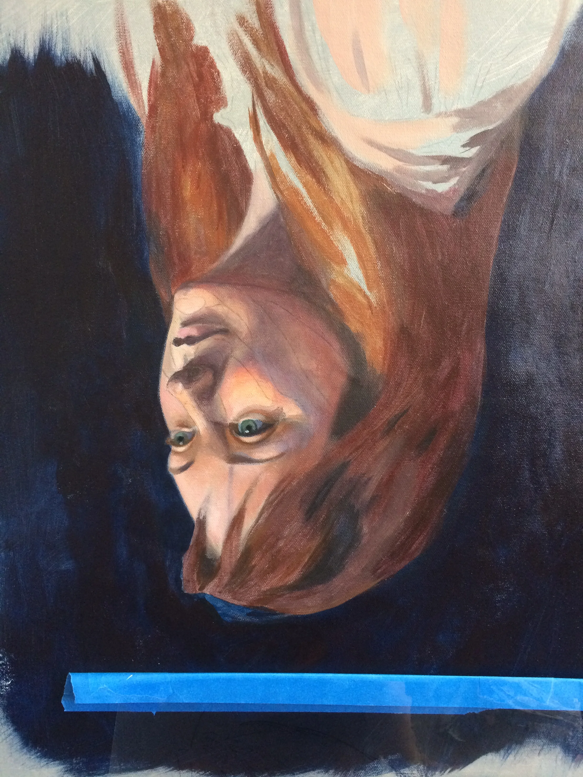
We worked from a live model as well as a photograph. This was extremely difficult. Ideally the model would be present the entire time, but that isn't practical. We began with setting up the backdrop and her attire, changing things based on how they reflected against her skin and hair. Once we settled on the look we shot a series of photos. This whole process took an entire day. The photography process could be a class in and of itself because there is so much to understand like lenses, lighting, distance, etc.

CochranStudioPortraitDee

CochranStudioPortraitDee

IMG_2461

IMG_2461

IMG_2455

IMG_2455

The difficulty in this class was having to move from the photograph to the model when she was present. In the photograph the values and temperatures were completely different. In real life these things were much clearer and more vibrant if you really studied her. In starting out I did my usual thing of blending tiny brush strokes and by the end of the first day it had no dimension. Up close, yes, but when you stepped back everything collapsed. So I began round two and finally hit my stride. I stood back at arms length with a long handled paint brush and contemplated each stroke of color. This also made it easier to paint with the type of paints we were using; Golden's Heavy Bodied Acrylics. I'm used to using Golden's Proceed line of mural paints which have a much longer open time and are less opaque, thus requiring a different method of application- multiple translucent layers.

IMG_2435

IMG_2435

IMG_2436

IMG_2436

IMG_2441

IMG_2441

Painting skin is a whole different ballgame than painting other surfaces. There is a luminosity and depth that is hard to achieve. The tricky part is capturing the subtle temperatures of the values; warm darks, clear and vibrant midtones, cool lights. And this can all change depending on the lighting. I spent more time looking and studying than I did putting paint on the canvas. I hope with practice I'll be able to identify these types of things more efficiently.

IMG_2465

IMG_2465

I am usually a fast painter and I think that I should have stopped while I was ahead but having about a day and a half left I continued to tinker with it. Which is fine because no one is paying me for this! I switched over to Golden's Open Acrylics which are similar to the Proceeds but have a heavier body like their regular line. This allowed me to blend a bit more and smooth out some values. But stepping back again, things began to fall flat. I wasn't worried as much this time because I felt I had gotten what I wanted from the exercise.

IMG_2656

IMG_2656

My dear friend Jeanne stayed with me during the week and we had amazing philosophical discussions about art and life. Jeanne and I met while working for William on his project, The Dreaming, in Downtown Frederick, MD in 2006.  She came up a few summers ago to help with the Extreme Makeover Project I was involved in. Jeanne is a free spirit, full of energy, extremely talented, and I wish she lived closer.

IMG_2473

IMG_2473

On Saturday after the class, Jeanne and I headed down to DC to visit the National Portrait Gallery. Its a shame that I live so close to such amazing museums and I've never been to this one. We spent the day there, seeing as much as we could. With new eyes, I was able to really study the brush strokes and color. Some of my most favorite are below.

IMG_2505

IMG_2505

IMG_2511

IMG_2511

IMG_2492

IMG_2492

IMG_2539

IMG_2539

IMG_2519

IMG_2519

IMG_2533

IMG_2533

IMG_2537

IMG_2537

IMG_2513

IMG_2513

IMG_2514

IMG_2514

IMG_2498

IMG_2498

Aaaaaaannnnnnd..........done.

IMG_2546

IMG_2546

BSO Decorator Show House 2015

10993443_721634897957303_992965775321036297_n

10993443_721634897957303_992965775321036297_n

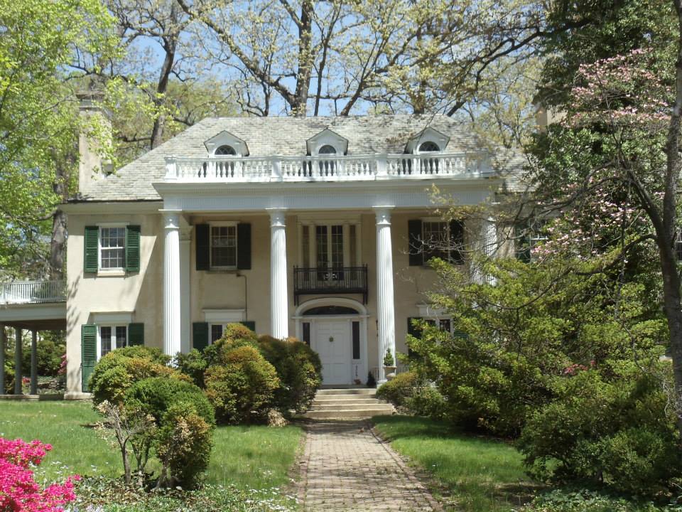
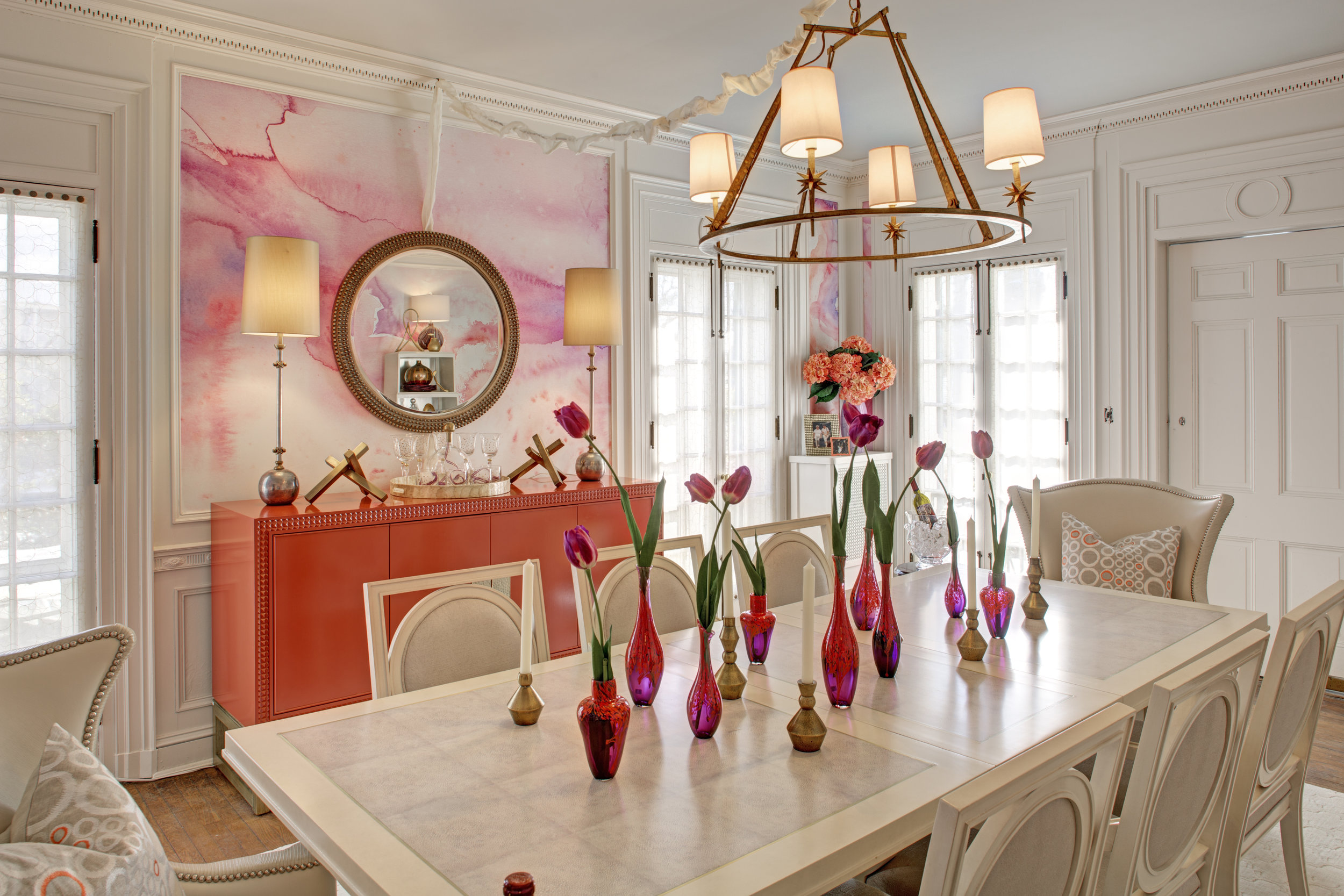
I'm so excited to finally share the work I did for Paula Henry of Simply Put Interior's Dining Room at this year's BSO Decorator Show House! The house was located in the Guilford neighborhood of Baltimore City.

BSO 2015 0001

BSO 2015 0001

Paula and I wanted to do something unexpected and so we decided on a unique watercolor design. I painted the design by hand and with the help of Jeff Salava of Archival Arts and Matt Richardson of Indigo Ink, brought the design to life. The colors were inspired by a fabric as well as the beautiful sideboard. Paula wanted a fresh and bright look to bring this room into the 21st century. The room before:

IMG_6304

IMG_6304

I am excited about this new avenue and hope to offer bespoke wallcoverings in the near future! Here are some more photos. Let me know what you think in the comments!!

BSO 2015 0011

BSO 2015 0011

BSO 2015 0009

BSO 2015 0009

BSO 2015 0008

BSO 2015 0008

BSO 2015 0006

BSO 2015 0006

BSO 2015 0003

BSO 2015 0003

BSO 2015 0002

BSO 2015 0002